It sounds like a contradiction: a video game genre celebrated for exploration, discovery, and non-linear freedom suddenly decides to hide the map. Yet more and more modern metroidvanias use retro map design to fight player anxiety, and Hollow Knight is the clearest example. Where earlier games gave players a fully detailed world map from the start, Hollow Knight hands you a blank sheet of parchment, a quill, and a vague sense that maybe, just maybe, you left the last safe bench too soon. This deliberate step backward is not nostalgia for nostalgia’s sake. It is a calculated design philosophy that turns spatial confusion into emotional engagement, forcing players to slow down, pay attention, and build their own mental geography — one scratch at a time.
The Quiet Revolution of the Blank Map
Before Hollow Knight, most metroidvanias treated the map as an objective layer. You could see every room, corridor, and secret passage almost as soon as you entered a new area. That approach worked, but it also flattened one of the genre’s most powerful emotions: the thrill of the unknown. When everything is visible, discovery becomes a chore, not a surprise. You are not exploring a world; you are checking off a checklist.
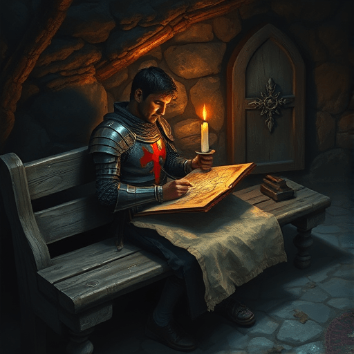
Hollow Knight changed the conversation in 2017, and its influence has only deepened since. Its map-and-quill system is now shorthand for an entire design pattern. Early in the game, you meet Cornifer, a wandering mapmaker humming to himself in the dark. You can hear him before you see him. Buy his incomplete map, and you have only a skeleton — the outlines of rooms, maybe a few landmarks. The rest is blank space. Then the real work begins. You must find a bench to sit on, pull out your quill, and watch the map fill in based on what you have actually explored. Until then, every turn you take is a leap of faith.
This system revives the NES-era ritual of self-cartography. In the 1980s, players of the original Metroid and The Legend of Zelda often kept graph paper beside the television, sketching rooms, marking dead ends, and tracing paths to the next boss. The game gave you nothing but a screen. The map lived in your notebook and, more importantly, in your head. Hollow Knight’s map-and-quill mechanic is a digital version of that experience, adapted for an age when attention spans are shorter and players are less willing to feel lost.
Why Vagueness Feels Better Than GPS
The psychological reason modern metroidvanias use retro map design to fight player anxiety is not about making the game harder. It is about managing cognitive load. When players are handed a fully detailed map, they tend to rely on it as an external memory system. The brain offloads navigation to the HUD, which sounds efficient but often backfires. The more you stare at the map, the less you actually see the world around you. You are disconnected from the environment, racing from objective marker to objective marker, and the anxiety of “missing something” grows with every grayed-out icon.
A blank map forces your brain to switch from passive HUD-reading to active spatial construction. Psychologists call this process “wayfinding” — the combination of perception, memory, and decision-making used to move through space. When you navigate without a detailed map, your hippocampus works harder to build a cognitive map. Every dead end, every looping corridor, every vertical shaft becomes a memory anchor. You start to recognize rooms not by their names but by their emotional signatures: the climb that almost killed you, the bridge that held a secret, the quiet corner where a bench finally appeared.
This active mental mapping is what gamers now call “flow through uncertainty.” The brain is not actually relaxed; it is engaged in a lower-pitch hum of pleasant tension. The absence of a perfect map does not give you anxiety — it gives you something to solve. Each new room is a question, and the map is the answer that you earn by moving forward. That is why Hollow Knight and its successors feel so immersive. The uncertainty keeps you present, and the slow process of filling in the map creates regular, satisfying releases of dopamine.
Slower Exploration, Deeper Immersion
One of the most direct ways modern metroidvanias use retro map design to fight player anxiety is by slowing down the entire exploration loop. In a typical modern action game, the player dashes through a level, glances at a minimap, and never thinks about the space again. In a retro-inspired metroidvania, every room is a decision. Do you go left into the dark cave or upward toward the spiky ceiling? Not all paths will be useful. Some will be dead ends designed to waste your time. But that “wasted time” is exactly the point — it creates a rhythm of hypothesis, testing, and memory.
Hollow Knight makes slowness tactile. The map does not update in real time. You must find a bench, sit down, and animate the quill pulling ink across paper. This is not a loading screen. It is a ritual. It tells your brain: you have safely paused, and now we can integrate what we have learned. The same trick appears in other modern metroidvanias. Afterimage, Blasphemous 2, and Ender Magnolia all use variations of the “hand-drawn map” idea. Some update the map automatically but in a rough, non-pixel-perfect way. Others require you to find NPCs or special items before map-drawing is even possible. The result is the same: exploration becomes a conversation between you and the world, not a transaction filtered through a UI menu.
This approach also gives metroidvanias a tactile identity. A map that looks like parchment, stained with coffee and marked with handwritten letters, feels diegetic. It belongs to the character within the world, not to the player floating outside it. The map becomes an artifact — a piece of lore you are creating with your own hands. That is a much more powerful attachment mechanism than a glowing blue line on a GPS overlay.
Designing for the Anxious Explorer
As the industry enters the current era of endless open worlds and live-service checklists, it is no surprise that many studio designers are looking for the opposite value proposition. Modern metroidvanias use retro map design to fight player anxiety because anxiety is the defining emotion of too many modern games. The fear of missing out, the pressure to optimize, the FOMO-driven side-quest piles — all of them turn exploration into labor. Retro map design is a rejection of that labor. It says: you are allowed not to know. You are allowed to turn around. You are allowed to feel lost and then find your own way back.
This is a nuanced design balance, and it has failed in lesser games. If a map is too vague, players stop caring and wander aimlessly. If it is too detailed, the anxiety returns. Hollow Knight succeeded because it provided just enough structure: the map outline is incomplete, but each major entrance is defined, and the world is built with strong landmarks. The game pauses at the right moments, giving you a bench, a quill, and a burst of orientation before sending you back into the unknown. This rhythm is not accidental. It is a carefully tuned anxiety curve.
The Future of Retro Cartography in Metroidvanias
Because players are actively pushing against the anxiety of modern open worlds, the map-and-quill system is becoming a signature of thoughtful game design. Indie developers are experimenting with even more physical map mechanics: notes that require special ink, maps that can be torn or burned, or maps that only show what your character actually remembers. The expected result is a generation of metroidvanias that treat navigation as a core ability to be upgraded, learned, and refined. The map is not just a tool. It is a character, a companion, and sometimes an adversary.
None of this means full, detailed maps will disappear. Some players will always prefer them, and there is room for leniency in accessibility options. But the reason modern metroidvanias use retro map design to fight player anxiety runs deeper than nostalgia. It gives players a sense of authorship over the world. When you fill in a blank map yourself, you are not merely consuming a game world — you are building it, chunk by chunk, in the best possible way. That is a powerful antidote to the pressure of modern exploration, and it is exactly why the quill and parchment are here to stay.
Conclusion
In a gaming landscape that overwhelms players with icons, notifications, and map markers, the retro map design of modern metroidvanias is a quiet rebellion. By making the map an earned, personal object, developers like Team Cherry have transformed navigation from a source of stress into a source of meaning. Hollow Knight’s map-and-quill system proved that the blank page may be the most powerful map of all.