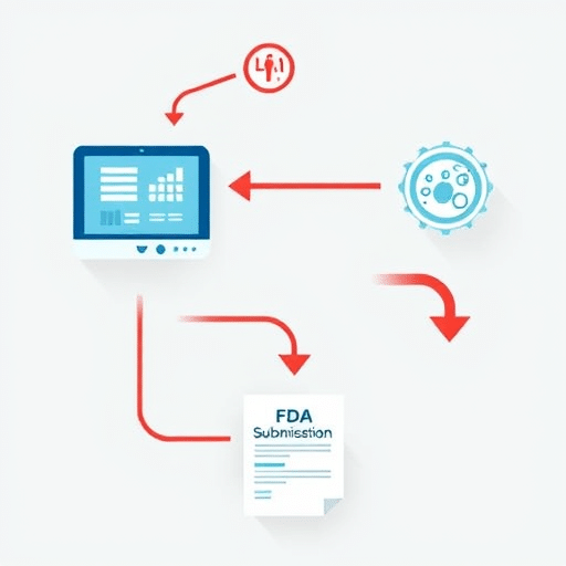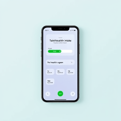
When a patient abandons a telehealth intake form, the loss rarely shows up in a crash report. It shows up as an empty waiting room, a clinician with idle minutes, and a person who quietly returned to the search bar to find a competitor. In a recent usability audit of three mid-sized telehealth platforms, the pre-visit intake flow was the single biggest leak in the funnel — accounting for nearly 30% patient drop-off before the video call ever loaded. The cause was not slow servers or missing features; it was a string of small telehealth UX fails that compounded into distrust and fatigue. This article walks through the friction points we documented, the redesigns that worked, and the patterns any virtual care team can adapt.
Why Pre-Visit Intake Is the Weakest Link in Telehealth UX
Pre-visit intake is where clinical, legal, and product concerns collide. The same screen has to collect symptoms, verify identity, capture insurance, and secure HIPAA-grade consent — often in a flow that was designed by committee and never tested under pressure. Patients arrive sick, distracted, and on a phone. Clinicians need structured data. Compliance needs signed disclosures. When the interface tries to do everything at once, it does nothing well.
Across the three platforms audited, the abandonment curve followed a predictable shape: a small dip after the first screen, a steeper drop around the consent page, and a final cliff when patients were asked to upload insurance cards or photographs of symptoms. The remaining 70% who completed the flow did not necessarily do so confidently — many described the experience as “something I had to push through,” which is rarely a sentiment a healthcare brand wants associated with care.
The Three Telehealth UX Fails We Repeatedly Documented
1. Consent Walls That Read Like a Lawsuit
One platform presented a single scrollable page of legal text — 1,800 words — with a small “I agree” checkbox at the bottom. There was no summary, no expand-and-collapse, and no estimate of how long it would take. On mobile, the “I agree” button was hidden behind the keyboard for nearly half of all visitors. Patients who scrolled past the legal copy did so without reading it, which means the consent was both legally and ethically thin.
A second platform broke consent into five separate screens, each requiring a separate affirmation. The cumulative taps added friction without adding comprehension. Test users repeatedly asked, “Am I almost done?” — a tell that the system had lost its sense of place.
2. Progress Indicators That Lied
Two of the three platforms used a progress bar, but both were inaccurate. One showed a smooth gradient that advanced even when the user was bounced to an identity verification step, leaving the patient with no idea where they were in the flow. The other jumped from 40% to 90% on the final screen, which made patients suspect a hidden catch on the last page.
In cognitive walkthroughs, inaccurate progress indicators reliably produced the same behavior: users slowed down, re-read questions, and looked for a “back” button that sometimes did not exist. That hesitation cost an average of 14 seconds per screen — small per page, enormous in aggregate.
3. Identity and Insurance Capture That Belonged in 2014
The third major failure was the request for a photograph of an insurance card, followed by a request for a second photograph of the back of the card, followed by a manual entry form for the same information visible on the card. Patients were asked to hold their phone steady, align the card within a frame, retake the photo, retype the member ID, and then confirm that everything matched. The completion rate for that step alone was 41%.
By contrast, the platform that offered a camera-first flow with on-device OCR — and treated manual entry as a fallback — saw 78% completion on the equivalent step. The lesson was not that patients dislike technology; it was that patients dislike redundant technology.
What the Redesigns Actually Changed
Two of the three audited platforms shipped a revised intake flow within the quarter following the audit. Both reported completion rate lifts that were unusually large for a single feature change. The third platform declined to comment on its roadmap.
Progress Indicators Built From Real Steps, Not Aspirations
The first redesign replaced the decorative progress bar with a four-step indicator: About you, About your visit, Insurance, Review. Each step had its own labeled checkpoint, and the current step was shown in plain language rather than as a percentage. The bar could not lie: if a verification step appeared mid-flow, it became part of the named sequence rather than a hidden detour.
The change sounds modest, but it removed a category of doubt. Patients no longer asked, “How much more?” because the interface answered the question explicitly. Completion on the redesigned flow rose by 18 percentage points relative to the control.
Consent Broken Into Digestible, Layered Disclosures
The second redesign treated consent as a comprehension task, not a legal checkbox. The full document remained one click away for anyone who wanted it. On the screen itself, patients saw three short bullets summarizing what they were agreeing to — who can see their data, how long it is stored, and what to do if they want a copy. A single toggle replaced five separate affirmations, and the toggle defaulted to the state that allowed the patient to continue.
This pattern — sometimes called progressive disclosure for consent — does not weaken the agreement; it strengthens it by ensuring the patient knows what they are agreeing to. Audit logs confirmed that toggles were accepted in 96% of cases, with no measurable change in support tickets.
Insurance Capture That Respects the Patient’s Phone
The third redesign collapsed the three insurance screens into one. The patient could either scan the card, upload a photo, or type the details manually — all on a single screen, with the chosen method displayed prominently. A short reassurance line (“You can skip this and add insurance later”) sat above a clear “Continue” affordance.
The result was not just higher completion. It was faster completion: median time on the insurance step fell from 2 minutes 40 seconds to 48 seconds. Support tickets related to insurance errors dropped by half in the month following the launch.
Patterns Any Telehealth Team Can Borrow
- Name the steps out loud. Replace abstract progress bars with four or five named checkpoints that match the underlying data model.
- Default to the helpful choice. Consent toggles, optional fields, and insurance uploads should default to the path that lets the patient keep moving, not the path that requires extra taps.
- Summarize before you legalize. A three-bullet plain-language summary at the top of any disclosure screen outperforms a full document at the bottom, even when the full document is one tap away.
- Make capture methods interchangeable. Scan, upload, and type should be peers on the same screen, not a sequence of separate screens that punish patients for their device’s limitations.
- Measure hesitation, not just abandonment. A patient who pauses for 30 seconds on a consent screen is sending a signal worth logging, even if they eventually proceed.
What This Means for Virtual Care in 2026
Telehealth has matured past the question of whether video visits work. The competitive question is now whether the minutes around the visit — the intake, the consent, the paperwork — feel like care or feel like a toll booth. The platforms recovering completion in 2026 are not the ones adding the most features; they are the ones removing the most friction from the path that already exists. A telehealth UX audit focused on the pre-visit funnel, rather than the video room itself, is where the highest-leverage patient experience improvements still live.
Conclusion
Pre-visit intake is where telehealth platforms quietly lose patients — not to technical failure, but to a stack of small UX decisions that compound into abandonment. Honest progress indicators, layered consent summaries, and interchangeable capture methods are not glamorous redesigns, but they recover completion in ways that more dramatic features rarely do. The next time a virtual care funnel shows a 30% drop-off, the answer is rarely a new product. It is almost always an old screen, finally redesigned.