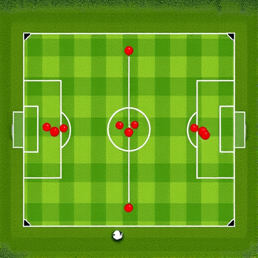
The days of relying on side-eye glances and gut feelings are fading. For any soccer fan looking to understand why a team dominated yet lost, learning to read shot maps is the fastest upgrade. This step-by-step visual guide is designed specifically for soccer fans without coding skills, and by the end, you’ll read shot maps in 5 minutes like a seasoned analyst. No spreadsheets, no Python, just your eyes and a bit of context.
Why Shot Maps Matter in 2026
Shot maps have become the default language of football analysis. Across broadcasts, social media, and club websites, you’ll see a green pitch with circles and crosses. In 2026, even amateur fan channels use them to break down matches. The reason? A shot map condenses 90 minutes of attacking action into a single image. It tells you where shots came from, whether they were meaningful, and often why a team won or lost. They have turned abstract statistics into something you can see at a glance, making advanced analysis accessible to everyone.
The Anatomy of a Shot Map: Position, Size, and Color
Before you read anything, know the basics. A shot map displays the attacking half of the pitch, with the goal at one end. Each shot is represented by a circle or pyramid. The shape’s location shows where the attempt happened. The size or color indicates the likelihood of scoring—often this is calculated as expected goals (xG). Larger or redder circles mean high-quality chances. Small blue dots are low-value long shots. Some maps also include crosses or other symbols for blocked or off-target attempts.
Key visual cues to memorize
- Position: Relative to goal and penalty box.
- Size: Bigger circle = higher xG.
- Color: Sometimes used instead of size; warm colors (red/orange) = better chances.
- Symbols: Dots for shots on target, X’s for off-target, squares for blocked.
Step 1: Look at the Overall Picture from Every Angle
Don’t get lost in individual circles. First, scan the entire map. Are shots clustered inside the six-yard box or sprayed from 30 meters? Is the attack balanced or one-sided? This big-picture view instantly tells you the team’s strategy. For instance, a team that takes many shots from wide, tight angles probably relies on crossing. A team with a heavy cluster right in front of goal creates through-ball chances. That’s your first clue. For example, a side that hammers 25 shots but all from outside the box is not creating dangerous opportunities; they are just closing their eyes and shooting under pressure.
Step 2: Spot High-Danger Areas with “Big” Circles
Now focus on the largest or reddest circles. These are the so-called “big chances.” Count them up. A map with two massive circles and ten tiny ones tells a different story than one with fifteen medium circles. The former highlights a team that creates rare but clear opportunities; the latter suggests volume without precision. For a quick read, you only need to identify the top three or four highest quality shots. You can quickly see if a team’s striker is getting into the right spots or if they are forced to shoot from worse angles than they’d prefer.
Step 3: Compare Shot Volume vs. Shot Quality
Here’s where the magic happens. You’ll often hear announcers say “they had more shots, but the better chances fell to the other team.” That’s visible on the map. Compare the number of shots against the size/color distribution. Two teams can both have 10 shots, but if all 10 for Team A are small blue dots from 25 meters, while Team B’s 10 include three red circles inside the box, you know Team B was far more dangerous. That difference is the best predictor of which side should have won, regardless of the final score. This volume-versus-quality comparison is the core of shot-map reading.
Step 4: Identify the Story Behind the Pattern
A shot map is not just a chart; it’s a narrative. After looking at position and quality, ask yourself: What does this pattern reflect about the match? For example, a team that only shoots from distance might be facing a deep block and struggling to penetrate. Alternatively, a map with a huge cluster at the edge of the box could indicate frustration or a reliance on set pieces. Match this with match events you know—like a red card or a tactical switch—and you’ll unlock deeper insights. The patterns often align with the flow of the game, revealing tactical plans that are invisible during a live broadcast.
Common Mistakes When Reading Shot Maps (and How to Avoid Them)
Even experienced fans fall for these traps. First, ignoring shot outcome. Not all attempts are equal—a shot that hits the post is not the same as one that dribbles wide. Many maps use different symbols for on/off target; check the legend. Second, looking only at the average xG, rather than the distribution. A single high xG chance can distort the average. Third, forgetting that shot maps don’t include assists or penalty awards. They are a slice of the game, not the whole pie. Also, if a map shows no shots from dangerous central areas, that often means the team lacked creativity or a proper target striker—a key insight for your next viewing.
A quick checklist for every shot map
- Check the legend and units.
- Identify the largest high-value chances.
- Look for positional clusters.
- Compare the two teams’ maps side by side.
- Think about match context.
How to Practice Your Shot-Map Reading Skills
You don’t need coding skills to gain fluency. Start by opening match reports from your favorite league and glancing at the shot maps before reading the summary. Form your own hypothesis. Then see if the match article agrees. Another great exercise is to use the interactive maps on major sports sites, where you can hover over individual shots to reveal distance and xG. Over time, you’ll spot patterns in seconds. Try to predict the winner based only on the shot map, then check the actual result. You’ll be surprised by how often the map tells the truth.
For more on the underlying numbers, take a look at how expected goals are calculated to understand why a shot from that angle carries a certain value.
Making Shot Maps Work for You in 2026
The newest shot maps now include player overlays, heat zones, and timeline sliders. But the core skill remains the same: a quick visual read. In 2026, fans who can interpret these graphics can engage in smarter debates, better predict momentum shifts, and even qualify their own scouting opinions. It’s a modern football literacy that rewards practice and curious eyes. Shot maps are no longer reserved for analysts in TV studios; they are for every supporter who wants to see past the scoreboard and into the real flow of the match.
Reading shot maps is a valuable skill that changes how you watch soccer. In just five minutes, you can parse the visual noise and focus on what matters: the quality, placement, and story of every goal-scoring attempt. With this step-by-step approach, you’ll no longer feel lost in the circles and dots—you’ll be the friend who explains why a losing team was actually the better side.