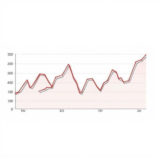
Every season, a team or player catches fire. A shooter suddenly can’t miss from three-point range, a pitcher mows down twenty straight batters, or an underdog rips off seven wins in a row. Fans start shouting “contender,” and the highlight reels run on loop. But if you want to separate actual championship-caliber performance from a lucky stretch, you need more than excitement. You need to use regression to spot real contenders — and the simplest way to start is with moving averages.
This isn’t about advanced calculus or proprietary sports databases. With a spreadsheet and a few basic formulas, you can build a simple model that smooths out the noise, reveals underlying trends, and tells you whether that hot streak is a signal of sustainable skill or just variance having fun with your emotions.
Why Hot Streaks Fool Us
Human brains are wired to see patterns, even when none exist. A four-game winning streak feels like a trend. A sudden jump in a player’s batting average feels like a breakout. But sports outcomes are noisy — a single game is affected by travel fatigue, matchups, a bad bounce, even the altitude of the arena. When you focus on a short window, you’re essentially listening to the static of a radio and mistaking it for a song.
The key concept to understand is mean reversion: performance tends to move back toward a player’s or team’s true talent level over time. A hot streak is often just the tail of a statistical distribution, not a new reality. Regression analysis helps you estimate that true level by cutting through the short-term noise.
The Moving Average: Your First Regression Tool
A moving average is exactly what it sounds like: you take a rolling window of recent results, calculate the average, and plot that point for each game or week. As the window slides forward, you get a smooth curve that hides the jagged peaks and valleys of individual performances. This curve is your crude regression model — it literally “regresses” the chaotic data toward a clearer central tendency.
Let’s walk through a beginner-friendly example. Suppose you want to evaluate whether a basketball team’s recent 8-game winning streak makes them a real title threat. You have their points scored and points allowed for every game this season. Compute the moving average of their point differential (points scored minus points allowed) over, say, 10-game windows. The result will show you the team’s underlying momentum without getting distracted by a single 40-point blowout or an overtime loss.
Simple Moving Average (SMA)
A simple moving average is the arithmetic mean of the last n values. For a 10-game SMA, you add up the point differential for games 1 through 10, divide by 10, then do the same for games 2 through 11, and so on. Each new data point replaces the oldest one, which makes the average “roll” forward.
This is the place to start if you’ve never done this before. Open Google Sheets or Excel, paste your data, and use the AVERAGE function with a sliding range. The smoothed line you generate will quickly reveal whether the recent hot streak is a genuine elevation or just a spike above the team’s established baseline.
Exponential Moving Average (EMA)
A simple moving average treats all games in the window equally. But in sports, recent performance probably matters more than what happened ten games ago. An exponential moving average fixes that by giving greater weight to recent results, making the curve more responsive to genuine changes in form without disappearing into noise.
If you want to be a slightly more sophisticated analyst, EMA is your next step. The formula looks intimidating at first (you multiply the latest value by a smoothing constant and add it to the previous EMA), but spreadsheet applications have built-in functions like EMA or you can use a short custom script. The result is a faster-reacting trend line that’s excellent for spotting when a “hot” team is just peaking — or when a “cold” team is actually improving.
A Step-by-Step Tutorial for Spotting Real Contenders
Let’s apply this to a practical problem. You want to know if the Toronto Blue Jays’ recent 12-game winning streak is a genuine sign they can contend for the playoffs, or if it’s just a lucky stretch against weak opponents. Here’s a simple workflow using moving averages and regression thinking.
- Step 1: Define your metric. For baseball, run differential is a solid proxy for team quality. For basketball, net rating works. For hockey, goals for/against. Choose a metric that’s robust and meaningful over a season.
- Step 2: Collect game-by-game data. You need at least 30–40 games of history to get a stable baseline. Scrape it from an API or copy it from a stats site.
- Step 3: Calculate a 10-game SMA for your metric. Do this for every game after the 10th. Plot it as a line chart.
- Step 4: Add a 30-game SMA as a second line. The longer window represents the team’s “true talent” baseline more closely because it suppresses short-term swings.
- Step 5: Compare the two lines. If the 10-game SMA is well above the 30-game SMA and then starts to fall back toward it, that’s mean reversion in action. The hot streak was probably variance. If the 10-game SMA stays consistently above the 30-game SMA across many windows — and the 30-game SMA is also trending upward — then you have evidence of real improvement.
- Step 6: Run a simple regression. You don’t need a stats degree. In a spreadsheet, put a column of “games played” and a column of your chosen metric. Use the built-in
LINESTorTRENDfunction to calculate a linear trend over time. A positive slope with a high R-squared value (say, greater than 0.3 or 0.4) suggests a genuine upward trajectory.
What the Numbers Actually Tell You
Moving averages won’t give you a definitive answer — no method can guarantee which team will win the championship. But they will help you assign probabilities. If a team’s 10-game SMA is far above its season-long average and then regresses, you know that their hot streak was less meaningful than it appeared. Conversely, if a team’s moving average has been steadily climbing since the start of the season, you can confidently call them a real contender even if they just dropped three games in a row.
The key insight is to compare a short-term trend against a long-term baseline. This is the essence of regression: rather than assuming every movement is a meaningful signal, you look for changes that persist after controlling for random fluctuations. It’s a simple but powerful habit that separates casual fans from sharp analysts.
Common Pitfalls to Avoid
Even with moving averages, there are traps. Here are a few to keep in mind:
- Using too small a window. A 3-game average will still be noisy. Start with at least 8–10 games, and use 20–30 for a longer-term baseline.
- Ignoring strength of schedule. If a team dominates five bad teams, the moving average will look great even if they’re not actually good. Adjust for opponent quality if you can.
- Overfitting the smoothing. Exponential moving averages are great, but if you choose an extremely responsive constant, you’ll chase every swing. Balance sensitivity with stability.
- Confusing correlation with causation. A rising moving average might coincide with an easy stretch in the schedule, not a change in skill. Always ask why the trend is happening.
Putting It Together: A Quick Example
Let’s say the Miami Heat start the season 10–15, then suddenly win 9 of their next 11. Their 10-game SMA of net rating jumps from −1.2 to +4.6. Meanwhile, their 30-game SMA only moves from −1.0 to −0.5. The gap is huge, but the 30-game line is still below zero. A regression slope shows a slightly positive trend but with a low R-squared. The reasonable conclusion: the Heat are playing better, but the recent burst is not yet enough to call them a contender. Wait for the 30-game average to climb above +2 before you buy the hype.
That kind of measured judgment is exactly what “don’t trust hot streaks” means. Moving averages give you a lens to see the underlying reality, and regression gives you a language to talk about confidence. You won’t just be reacting to the latest highlight reel — you’ll be reading the season in a more honest, data-driven way.
Conclusion
Hot streaks are fun, but they’re not a reliable guide to who the real contenders are. By applying moving averages and basic regression thinking, you can look past the noise of recent wins and losses to find the underlying signal. Start with a simple average, compare it to a longer baseline, and let the data tell you when a streak is real. You’ll still be happily surprised by upsets — but you’ll no longer be fooled by them.