One-handed mobile gaming is no longer a niche use case. From commuters holding a subway rail to parents juggling a toddler, players increasingly need accessible game UI design that responds to the realities of how phones are actually held. In 2026, the studios shipping the most polished experiences are those treating thumb reach, palm stability, and adaptive screen zones as core design pillars rather than afterthoughts. This article explores the practical layout strategies, gesture patterns, and interface decisions that make a game genuinely comfortable to play with one hand.
Why One-Handed Design Is Suddenly a Competitive Advantage
Mobile analytics consistently show that more than 60% of touch interactions occur in the lower half of the screen, yet many games still scatter primary controls across the entire viewport. The result is awkward thumb stretching, accidental taps, and frustrated players who abandon sessions. Designing for one-handed play is not just about accessibility; it directly affects session length, retention, and review scores.
Recent hardware trends have amplified the problem. Larger displays on flagship phones mean users must reposition their grip constantly to reach top-of-screen elements. Meanwhile, foldables and compact gaming phones have revived interest in narrower aspect ratios that reward thumb-first thinking. Studios that adopt adaptive game UI design early are noticing measurable lifts in daily active users and a reduction in rage-quit metrics.
The Anatomy of a Thumb-Friendly Layout
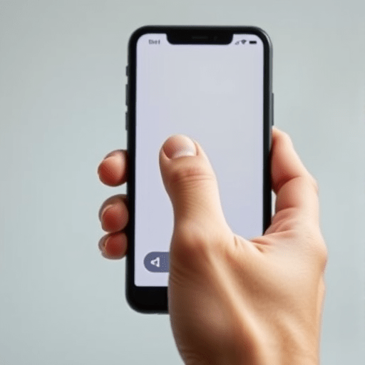
A truly one-hand-friendly interface starts with a clear understanding of the thumb arc. The natural pivot point is the base of the thumb near the wrist, and anything outside that rotational sweep forces the user to shift the entire device. Designers can use this insight to build three concentric zones: primary action at the bottom-right (for right-handed players) or bottom-left (for left-handed players), secondary actions in the mid-screen ring, and informational elements at the top.
Critical gameplay inputs should never sit above the 70% mark of screen height. Pause buttons, inventory toggles, and combat dials belong in the comfort zone. Players should be able to perform every essential action without lifting their thumb more than a few centimeters.
Dynamic Anchor Systems
One of the most effective techniques in modern mobile game interface design is the dynamic anchor. Rather than fixing UI elements to static coordinates, the layout listens for where the player’s thumb naturally rests and shifts critical controls into that hot zone. This can be implemented through a short calibration prompt the first time the game launches, or by tracking touch heatmaps across sessions and adapting silently.
Anchoring works especially well for action games with multiple simultaneous inputs. Movement sticks stay in the lower-left, but contextual action buttons can float toward wherever the thumb has been most active recently. The player feels like the game is reading their mind, when in reality the layout is simply responsive to their habits.
Gesture Vocabulary That Replaces Crowded Buttons
One-handed players benefit enormously when developers replace traditional buttons with gestures. A swipe up to reload, a double-tap to dash, a long press to crouch — these interactions free up valuable screen real estate and reduce the visual clutter that makes small screens feel overwhelming.
- Edge swipes for menu access without blocking gameplay
- Two-finger holds for precision actions when the player is briefly two-handed
- Flick gestures for direction-based attacks that feel physical
- Pressure-sensitive zones for analog-style inputs on flat screens
The key is consistency. Every gesture should be discoverable, every gesture should be cancellable, and every gesture should be rebindable. Players with smaller hands, motor impairments, or temporary injuries need the same flexibility as anyone else.
Reducing the Tap Budget
Every tap is a moment of cognitive load. Effective thumb-friendly game layouts aim for a low tap budget by combining actions intelligently. Hold-to-aim-and-shoot eliminates the need for separate fire and aim buttons. A radial menu that opens on a single press consolidates what would otherwise be five or six discrete icons. Designers should audit every screen and ask whether two adjacent buttons could be merged into a single, smarter interaction.
Visual Hierarchy for Small, Busy Screens
Layout alone is not enough. The visual hierarchy of a one-handed game UI must be ruthlessly prioritized. The most important element should be the largest, the highest-contrast, and the closest to the thumb. Everything else recedes into the background through reduced opacity, desaturated color, or smaller type.
Modern design systems use variable opacity layers: 100% for active controls, 70% for contextual information, 40% for ambient data like score or health, and 20% for purely decorative elements. This creates a clear visual hierarchy without requiring the player to actively parse which elements matter most. It also helps players with low vision or situational impairments (sunlight, motion) focus on what counts.
Typography and Iconography Considerations
Text in mobile game UI should never sit below 12 points at native resolution, and icons should have a minimum tap target of 44 by 44 points regardless of their visible size. Whitespace is not wasted space; it is a buffer that prevents mis-taps. Designers working on accessible mobile gaming interfaces should treat every pixel of padding as a usability feature, not a stylistic choice.
Responding to Player Posture and Context
One-handed play does not mean a single rigid posture. Players shift between vertical grips, horizontal grips, cradling the phone, or resting it on a surface. Smart interfaces detect these shifts through gyroscope data, touch patterns, or even device orientation changes, and adapt accordingly. A racing game might enlarge the steering zone when the device is flat on a table, while a puzzle game might push buttons closer to whichever corner the phone is tilted toward.
This is where adaptive layouts truly shine. Rather than choosing between portrait and locked modes, modern games offer fluid transitions. The UI morphs gradually as the player adjusts their grip, with animated repositioning that feels natural rather than jarring. In 2026, several engines now ship with built-in support for these adaptive containers, dramatically reducing the implementation cost for studios willing to invest in comfort.
Testing With Real One-Handed Users
No amount of theory replaces testing with the actual audience. Studios serious about one-handed design recruit players who hold their phone with one hand as a habit, including those with temporary or permanent disabilities that affect grip. These testers reveal pain points that internal QA teams miss: pinky strain from supporting the device, accidental back-grip touches on curved screens, fatigue during long sessions.
Observation is more valuable than surveys. Watching a player attempt a tutorial one-handed often exposes entire assumptions that need rethinking. Designers should also test in varied environments: standing on a bus, lying in bed, walking through a park. The conditions of real play are rarely the controlled silence of an office usability lab.
Looking Ahead: Where One-Handed Design Goes Next
Hardware innovations will keep pushing the field forward. Pressure-sensitive edges, ultrasonic gesture sensors, and improved haptic engines all create new opportunities for thumb-first interaction. Studios that build their UI architecture around flexibility today will be ready to integrate these inputs tomorrow without rewriting their entire interface layer.
The games winning player loyalty in 2026 are those that respect how people actually hold their phones. By centering adaptive layouts, gesture-based input, and visual clarity, developers create experiences that feel effortless from the first session. One-handed design is no longer a special accommodation; it is simply good design that finally matches real behavior.
The studios investing in thumb-friendly layouts today are quietly building the standard that the rest of the industry will catch up to tomorrow. Players notice when a game feels easy to hold, and they remember when it does not.