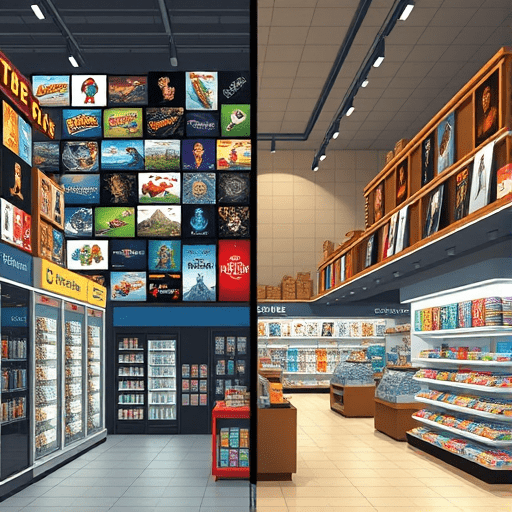
If your live game’s cash shop feels like a chore, you’re running the same playbook as a department store that puts its registers at the entrance and hides its best products in a back corridor. The team made a conversion-optimized checkout, not a shopping experience. In 2026, as live-service budgets tighten and players grow more sensitive to monetization patterns, that difference matters. Storefronts that feel like interruptions are being rebuffed; storefronts that feel like content are thriving. Retail UX has the tools to get you from the former to the latter.
Retail UX treats shopping as a journey, not a pop-up
Physical retail never asks a customer to leave the store to buy something. It uses pathways, lighting, and placement to make purchasing a natural extension of browsing. In digital games, the cash shop is often a fork in the road: a modal window, a loud badge, or a standalone menu hidden behind a “Store” button that loads slowly. That is interruption design. It breaks the player’s state of play and asks them to switch into consumer mode, which is exactly when their guard goes up.
Retail UX flips that sequence. In a well-designed store, the shopper isn’t interrupted; they are drawn into an environment where browsing itself is gratifying. An in-game shop can be the same. When a player enters the store between matches or during an open-world idle, the experience should feel like walking into a beautifully curated boutique, not a vending machine disguised as a menu.
Why virtual stores break subtle rules physical stores obey
Let’s take one small rule: the “landing zone” in retail. A physical store knows that the first few feet inside the door are decompression space; only once a customer adjusts do they begin searching. Many game stores ignore this entirely. You drop into a grid of tabs, currencies, and offers, and the visual noise is relentless.
Apply the same principle by presenting a visually calm first view. Show one featured item, a hint of what’s new elsewhere, and a clear path to “browse all.” That is a simple retail UX fix, but it can have an outsized impact on how players perceive the shop as intentional content rather than a pile of chores.
Make microtransactions feel like content, not interruptions
The phrase “content, not interruptions” is not a fluffy mission statement. It is a concrete design principle. Retailers know that people don’t want to be sold to; they want to find things. In a game shop, that means every purchase should feel like the end of a small story. A skin isn’t a random piece of pixels; it’s a collectible that matches a live event’s theme. A bundle isn’t a price anchor; it’s a curated selection tied to a narrative moment. A consumable isn’t a slot in a list; it’s a useful companion in the current season’s quest.
This is where internal store “narratives” can be applied in a retail-UX way. Instead of a list of ever-changing sales, use tabs that correspond to pending quests, current season events, and progression milestones. When a player opens the shop and sees “Items for Frostfell’s final quest” rather than “Daily Offers,” the purchase becomes a completion of a thought that already started during gameplay.
Create “dwell time” with themed aisles
Physical retail uses aisles to guide dwell time, not just to pack more stock. In-game, a “Seasonal Spotlight” section with an interactive preview and lore blurb can encourage players to linger. Giving the player the ability to rotate a character model, walk it around a fictional setting, and see it under different lighting conditions mirrors the tactile experience of picking up a product and examining it.
If the cash shop’s sole interaction is a “Buy” button, you are not in retail; you are in a ticket kiosk. Add a “Carefully inspect” mode that feels like content: show animations, sound effects, and stylized flavor text. That turns the act of browsing into an engaging mini-activity, not a chore.
Use shelf placement to drive behavior without coercion
Retail shelf placement is one of the oldest levers of purchasing behavior. Eye-level items sell more. Counter displays command impulse. End caps create urgency. Games have a direct digital equivalent, but it’s too often ignored in favor of simple date-based rotations.
If you’re trying to make a cash shop feel like content, think like a merchandiser. Put the most visually distinctive items at “eye level” in the first row. Place smaller consumables near the checkout action, not stacked in a wall of random resources. Group items into sets that look like a window display: “Mountain Survivor” could be a hat, gloves, and emote from the same expedition theme. This isn’t manipulative if it adds clarity; it’s simply letting good product design speak clearly.
Decoy pricing is about architecture, not discounting
Retail UX doesn’t rely on discount tags alone. Decoy pricing is a well-known pattern: offer three cosmetic tiers so that the middle one seems like the rational choice. But the same idea can be used to improve content perception. Place a premium bundle with a beautifully packaged legendary item beside a cheaper, less complete bundle. Now the lesser purchase doesn’t look like an arbitrary product; it looks like a stepping stone in a collection.
In a 2026 game, players are tired of simulated urgency. They are less motivated by flashing timers and more motivated by comprehensible premium lines. A well-designed decoy hierarchy respects the player enough to let them make a comparative choice. That is a more content-like purchase experience than “24-hour flash sale!” ever will be.
Retail UX also means making the shop a destination
A retail store is not a place you accidentally go to; it’s a destination you plan around. The best game cash shops behave the same way. Instead of constantly pushing the shop into the game loop through notifications, give players a reason to enter voluntarily. Add a daily “window display” that is visible from a hub lobby and changes whenever a new themed item drops. Let players leave a “wishlist” and ping them only when that item becomes available. This is a classic retail relationship pattern: attention is earned, not extracted.
This becomes more important as players in live-service games are developing “store fatigue.” A store that behaves like a real shop creates excitement through discovery. A store that behaves like an assignment is quickly labeled a chore.
Measure retail warmth, not just clicks
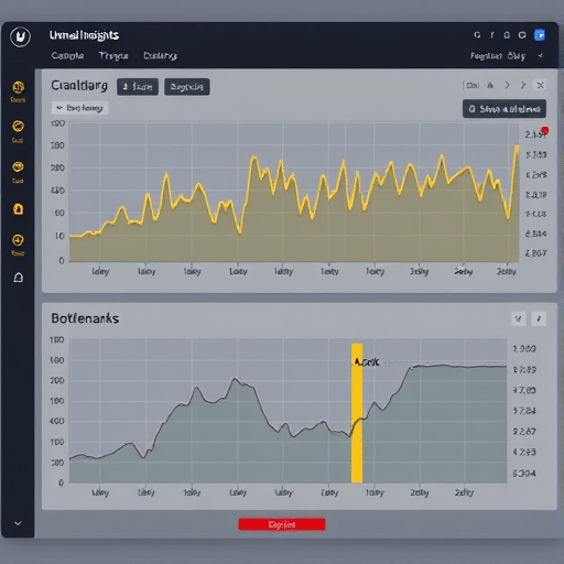
Dashboards in live games typically track conversion rate, revenue per user, and time-to-purchase. Those are valuable, but they do not tell you if your cash shop feels like content. Add retail-UX aware metrics: returning visitation rate to the shop when there is no new badge, the ratio of “browse before purchase” versus “instant purchase,” and sentiment change in chat reports after browsing, not just after buying.
You can also run a simple experiment. Remove every purchase button for a day and let players explore the shop as if it were a miniature museum. Watch how long they stay and where they linger. That reveals what parts of the store are actual content and which parts are just dull transaction slots.
Content-first also means respect for the player’s time
One reason the cash shop feels like a chore is that many live games treat shopping as an extra layer of mental math. Currencies, discounts, bonus currencies, battle-pass exclusive pricing, regional price tiers, and coupon stacks create a cognitive tax. Physical retail introduced “everyday low pricing” to solve exactly that: simplify the decision, make the price trustworthy, and let the delight of the object be the main reason to buy.
Apply this to your game. If a bundle costs 1,200 gems, don’t make the player convert to dollars in their head. Show the approximate real-world value in the same currency they earn in daily play. Let them signpost the purchase as a reward from playing the game. That transforms the transactional moment into a moment of reward.
Conclusion
The line between a cash shop that feels like a chore and one that feels like content is not about greed vs. generosity; it’s about architecture. Retail UX provides a mature, player-respecting method to organize products, guide discovery, and create delightful browsing. By clearing the visual path, staging products like physical displays, supporting open-ended browsing, and simplifying price architecture, live-game teams can turn their storefront into a place players want to spend time — and as a result, spend money. The shop isn’t the interruption; the purchase becomes a moment of content. That’s a retail upgrade worth making in any season.