Designing better controller UI for low motor control is about making the controller’s invisible logic visible and flexible. For players with tremors, spasticity, or limited fine motor precision, accidental presses often feel like the game is ignoring intent rather than acknowledging effort. The solution isn’t a special controller or a single “accessibility mode.” It’s a set of interface decisions: use on-screen button diagrams to show exactly how input maps to action, and adjust hold-vs-tap timing so the game accepts a press only when the player means it.
Why Accidental Presses Are Not Just a Hardware Problem
Accidental presses have typically been blamed on hardware triggers, stick drift, or shaky hands. But the more important culprit is often the UI layer that interprets every physical contact as a binary input. A quick brush against the shoulder button can become a grenade toss. A trembling thumb resting on the face buttons can cycle through an inventory. These problems are not solved by adding more physical resistance to the controller; they are solved by designing a controller interface that asks the player for confirmation in a measured, tolerant way.
When a player has low motor control, their input signal is noisy. The game cannot simply read a button state and assume intention. It must decode the player’s rhythm, pressure, and release pattern. That requires a UI that lets players configure how a press is recognized. A well-designed controller UI does not punish a player for holding a button a little too long or releasing a little too early. Instead, it gives them control over the timing window itself.
On-Screen Button Diagrams: Making Controller Input Visible
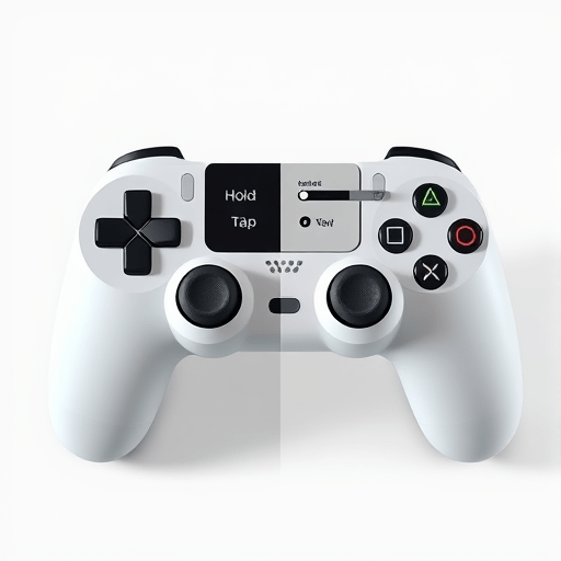
Most players know their controller by muscle memory. For someone with low motor control, muscle memory may be unreliable, and visual memory becomes the primary guide. That is why on-screen button diagrams are such a powerful tool. A clear diagram shows which physical button corresponds to which action, where the thumb should rest, and which part of the controller is being referenced by a prompt. Instead of a cryptic “Press B” text, the player sees a visual map of the controller with B highlighted.
Good diagrams do more than identify buttons. They reduce the cognitive load of translating a screen prompt into a physical movement. For a player who needs to reposition their hand before pressing, a persistent diagram can serve as a reference point. It turns the controller into a known landscape instead of a hidden obstacle course.
Static vs. Context-Aware Diagrams
Static diagrams show the full controller layout at all times. They are useful in menus, tutorials, and whenever the player needs to verify their mapping. Context-aware diagrams, on the other hand, update dynamically to show only the relevant buttons for the current moment. In a quick-time event, the diagram can zoom in on the target button and show the exact timing gesture required. For a player with tremors, that extra context can be the difference between a satisfying interaction and an accidental skip.
Diagram Design Details That Matter
For controller UI to be genuinely accessible, diagrams need to respect visual accessibility principles:
- Use high-contrast outlines around buttons, not just color changes.
- Show button shapes that match the player’s physical controller layout, including adaptive controller mappings.
- Allow the player to open the diagram at any time, even during cutscenes or timed sequences.
- Avoid pulsing or rapidly flashing highlights that can be distracting or visually triggering.
- Include labels for buttons that are currently mapped to alternate functions, such as “hold” versus “tap.”
Adjustable Hold-vs-Tap: Redefining What Counts as a Press
The most direct way to reduce accidental presses is to adjust how the game interprets the duration of a button press. Many games already use hold-to-activate versus tap-to-activate mechanics, but they rarely let players tune the threshold. A player with low motor control may not be able to tap quickly and release cleanly. They may need a short hold to stabilize their hand before the input is accepted. Conversely, a player who tends to grip the controller tightly may benefit from a longer hold requirement that filters out unintentional contact.
Adjustable hold-vs-tap settings are not just a toggle between “tap” and “hold.” They are a range of timing options that let the player define the exact length of a deliberate input. The UI should offer a slider for minimum press duration, a slider for maximum release time, and a preview area where the player can test both values.
Hold Duration and Tap Thresholds
A minimum hold duration ensures that a quick brush against a button does not trigger an action. If the player needs to hold for 250 milliseconds, a fleeting tremor will not register. If they need 500 milliseconds, they have even more time to stabilize their thumb before the input fires. The tradeoff is that longer hold requirements make rapid, rhythmic actions more difficult. That is why the setting must be adjustable rather than fixed.
Tap thresholds work on the release side. Some players may press a button but involuntarily keep their finger on it for too long, causing repeated activations. A tap threshold can prevent a held button from re-triggering until the player fully releases and presses again. This is especially useful for menu navigation, where holding a direction can scroll through multiple options unintentionally.
Ignoring Double-Presses and Bounce
For players with tremors, a single intended press can sometimes register as multiple rapid presses. This “bounce” is a well-known issue in input design. Adding an adjustable debounce interval—a short period after a press during which other presses are ignored—can dramatically reduce accidental inputs. The UI should present this as “ignore rapid repeated presses” or “minimum time between presses.” The player should be able to test it with a simple on-screen button to see the effect immediately.
Pairing Visual Feedback with Timing Controls
When a player has adjusted hold-vs-tap settings, they need to understand why some inputs are accepted and others are not. This is where on-screen feedback becomes essential. If a press fails because the hold duration was too short, the game should show that the input was received but not confirmed. A simple progress ring around the button icon can communicate how long the player needs to keep holding. This turns a frustrating rejection into a clear instruction.
Controller UI should also use haptic feedback as a complement to visual diagrams. A small vibration when a press is accepted, or a different pulse when a press is ignored, helps players with limited visual attention stay oriented. The combination of visual and haptic feedback creates a feedback loop that reinforces the timing settings without relying on fast reflex interpretation.
Implementation Tips for Developers
Adding on-screen button diagrams and adjustable hold-vs-tap settings requires more than a few menu entries. It requires a thoughtful implementation that respects the player’s controller mapping, preferred input device, and personal timing needs. The following practices can help developers build controller UI that actually reduces accidental presses:
- Offer per-button timing settings rather than a single global slider. A player may need a longer hold for face buttons but a shorter tap for shoulder buttons.
- Use the same button diagram component across menus, quick-time events, and gameplay prompts to create a consistent visual language.
- Let players preview hold-vs-tap changes in a low-pressure training area before entering a cinematic or combat sequence.
- Save accessibility settings per profile, not per save file, so players can move between devices or sessions without losing their configuration.
- Provide presets for common needs, such as “tremor-friendly,” “slow press,” or “avoid double presses,” while still allowing manual adjustment.
Testing with players who have low motor control is the most important step. What feels like a generous debounce window to a designer may still be too narrow for someone with an involuntary reflex. A user-driven test session will reveal which timing ranges feel natural and which diagram details create confusion.
Conclusion
Designing controller UI for low motor control is not about hiding complexity; it is about making input legible and forgiving. On-screen button diagrams give players a visual map of the controller, while adjustable hold-vs-tap settings give them control over the timing of each press. Together, they turn accidental presses from a constant source of friction into a minor, correctable detail. The goal is not to change how the player physically interacts with the controller, but to change how the game listens.