
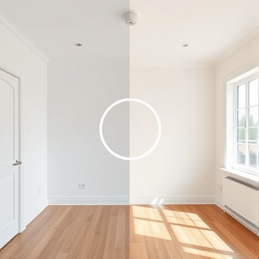
Whether you’re showcasing a photo retouch, a product redesign, or a home renovation, an interactive before/after slider is one of the most effective ways to let visitors see the change with their own eyes. The best part? You can build a before/after image slider using pure HTML, CSS, and JS in a single afternoon — no jQuery, no React, no third-party plugin required. This guide walks through a comparison tool driven by the browser’s native mousemove event and a carefully updated CSS width value. After the core is working, we’ll bring it up to a modern standard with pointer events, keyboard support, and responsive layout techniques that make the widget feel at home on any device.
How the Before/After Slider Works: Visibility Through Width
The underlying concept is wonderfully simple. Two panels occupy the same space: the “after” version sits on the bottom, and the “before” version sits on top. The top panel’s width decides how much of the left side belongs to the “before” image, while the rest reveals the “after” image underneath.
As the user moves their cursor across the container, a JavaScript listener translates the horizontal pixel position into a percentage, then applies that percentage to the top panel’s width. The result feels like a sliding divider, but in technical terms it is just CSS width mutation attached to a mouse event. Compared with animating a clip-path, using width requires fewer moving parts and allows the browser to handle the geometry naturally.
Building the HTML Structure for the Comparison Tool
We’ll use two div elements with CSS background images. This approach avoids the common headache of trying to scale an <img> inside a clipped overlay, and it keeps the markup shockingly tidy.
<div class="comparison" id="comparison">
  <div class="comparison__panel comparison__panel--after"></div>
  <div class="comparison__panel comparison__panel--before"></div>
  <div class="comparison__handle" role="slider" tabindex="0"
       aria-valuemin="0" aria-valuemax="100" aria-valuenow="50"
       aria-label="Drag to compare before and after"></div>
</div>
The first panel is rendered under the second one because it comes first in the document flow and both panels are absolutely positioned. The handle is a focusable element, which gives keyboard users something concrete to interact with.
If you prefer the base layer to be a real <img> for search-engine visibility, object-fit: cover will match the background-image panel.
Styling with CSS: Custom Properties, Aspect Ratio, and Overlay Width
Modern CSS makes this component dramatically cleaner than it would have been a few years ago. A custom property holds the slider position, aspect-ratio maintains the canvas height without padding hacks, and an overlay panel uses that variable for its width.
.comparison {
  --position: 50%;
  position: relative;
  aspect-ratio: 16 / 9;
  overflow: hidden;
  cursor: col-resize;
  user-select: none;
  -webkit-user-select: none;
  touch-action: none;
  background: #0f172a;
}

.comparison__panel {
  position: absolute;
  inset: 0;
  background-size: cover;
  background-position: center;
}

.comparison__panel--after {
  background-image: url("after.jpg");
}

.comparison__panel--before {
  width: var(--position);
  background-image: url("before.jpg");
  box-shadow: 2px 0 0 rgba(255, 255, 255, 0.9);
}

.comparison__handle {
  position: absolute;
  top: 50%;
  left: var(--position);
  width: 44px;
  height: 44px;
  border-radius: 999px;
  background: #ffffff;
  border: 2px solid rgba(0, 0, 0, 0.15);
  transform: translate(-50%, -50%);
  box-shadow: 0 4px 12px rgba(0, 0, 0, 0.25);
  cursor: col-resize;
}
The box-shadow on the before panel acts as the divider line. Because the handle is translated by 50 percent on both axes, it stays centered over the boundary no matter where the slider sits.
Adding the Core Logic with JavaScript and the mousemove Event
The interaction logic is compact. We read clientX, subtract the container’s left edge, and convert the result into a percentage. That percentage then updates the custom property from the previous section, which moves both the overlay width and the handle position in one step. No DOM queries need to run during the drag, so the operation stays smooth even on low-powered phones.
const comparison = document.getElementById("comparison");
const handle = comparison.querySelector(".comparison__handle");

function setSliderPosition(clientX) {
  const rect = comparison.getBoundingClientRect();
  const x = Math.min(Math.max(clientX - rect.left, 0), rect.width);
  const percentage = (x / rect.width) * 100;
  comparison.style.setProperty("--position", percentage + "%");
  handle.setAttribute("aria-valuenow", Math.round(percentage));
}

comparison.addEventListener("mousemove", (event) => {
  if (event.buttons === 1) setSliderPosition(event.clientX);
});

comparison.addEventListener("mouseenter", (event) => {
  setSliderPosition(event.clientX);
});
The event.buttons === 1 check guarantees that the slider only tracks the cursor while the primary mouse button is held down. The mouseenter listener makes the slider jump to where the user first enters the container, which feels natural for comparison tools.
Upgrading to Pointer Events for Touch and Stylus Support
In 2026, supporting touch is non-negotiable in a modern responsive build. The mousemove event does not fire for touch gestures, so we’ll replace the mouse listeners with Pointer Events. This unified API handles mouse, touch, and stylus through the same code path. We also track the drag state with a simple boolean flag rather than event.buttons, which behaves more predictably across touch browsers.
let isDragging = false;

comparison.addEventListener("pointerdown", (event) => {
  isDragging = true;
  comparison.setPointerCapture(event.pointerId);
  setSliderPosition(event.clientX);
});

comparison.addEventListener("pointermove", (event) => {
  if (isDragging) setSliderPosition(event.clientX);
});

comparison.addEventListener("pointerup", () => {
  isDragging = false;
});

comparison.addEventListener("pointercancel", () => {
  isDragging = false;
});
The touch-action: none rule we added to the container is critical here. It tells the browser not to intercept the gesture for scrolling, leaving pointer events in full control. With this small addition, the slider works on phones, tablets, and touch laptops out of the box.
Making the Slider Accessible with Keyboard Controls
A mouse-only interaction is an accessibility problem. The handle already carries the ARIA contract for a slider:
ARIA Attributes to Include
role="slider"announces the widget type to screen readers.aria-valueminandaria-valuemaxdefine the allowed range.aria-valuenowupdates live as the position changes.tabindex="0"gives keyboard users a focus target.
With those in place, we add arrow-key support to complete the experience.
handle.addEventListener("keydown", (event) => {
  let position = Number(handle.getAttribute("aria-valuenow")) || 50;

  if (event.key === "ArrowLeft" || event.key === "ArrowDown") {
    position = Math.max(position - 5, 0);
  } else if (event.key === "ArrowRight" || event.key === "ArrowUp") {
    position = Math.min(position + 5, 100);
  } else {
    return;
  }

  event.preventDefault();
  comparison.style.setProperty("--position", position + "%");
  handle.setAttribute("aria-valuenow", position);
});
Now screen reader users can announce the handle’s position, and keyboard users can nudge the divider in five-percent increments. This rounds out the component’s accessibility story without adding any dependencies.
Performance Considerations for Your Slider Images
A comparison slider is only as fast as the images it loads. These pointers will keep it lean:
Image Optimization Checklist
- Export both versions in modern formats like WebP or AVIF.
- Scale the originals to just above their display size.
- Keep the fallback stack solid for older browsers.
- Use an
IntersectionObserver-based lazy load if the slider is below the fold.
The aspect-ratio declaration does valuable performance work too. It reserves the correct vertical space before any pixels arrive, preventing layout shift and protecting your Core Web Vitals score. If the page contains more than one slider, reuse the same JavaScript function with different element references to keep the codebase maintainable.
Putting It All Together
With a few dozen lines of HTML, CSS, and JavaScript, you now have a fully working before/after image slider that runs as fast as the browser allows and works with a mouse, touchscreen, or keyboard. The combination of mousemove for direct interaction and CSS width for visual output remains one of the most elegant patterns in front-end development.