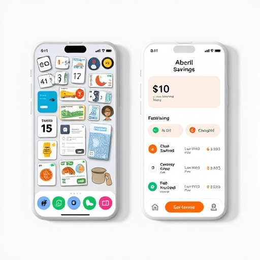
It’s one of the great ironies of personal finance: millions of people download savings apps with the genuine intention of building a financial cushion, yet their balances barely move. The uncomfortable truth is that why savings apps fail has less to do with user discipline and more to do with how their interface design triggers impulse spending. In the rush to maximize engagement, most apps have become extremely efficient at removing every obstacle between a user and a purchase — precisely why they undercut their own mission. Instead of protecting our money, they put it one tap away.
The Autopilot Purchase Problem: When Seamless Design Becomes a Liability
Modern savings apps borrow heavily from e-commerce, and it shows. They use large buttons, vibrant colors, infinite scrolling, and personalized notifications to keep users active. But the very same design patterns that make shopping apps addictive make savings apps dangerous. A user who logs in to check a balance is immediately greeted with cash-back offers, round-up boosts, and partner deals, each designed to be irresistible and frictionless. The result is the autopilot purchase: a transaction completed almost subconsciously, with the user only realizing later that their savings progress has quietly reversed.
Autopilot purchases thrive in interfaces that value speed over reflection. When a savings app offers one-tap investing or instant transfers to a spending account, it removes the natural pause between wanting and buying. Behavioral economists call this the default effect: people stick with the path of least resistance. If that path leads to spending, that’s exactly what users will do.
Buy-Anxiety and the Dopamine Loop: The Psychology Behind Impulse Spending
There’s a specific emotional state that savings apps unintentionally cultivate, and it deserves a name: buy-anxiety. It’s the anxious, almost urgent feeling that arises when an interface presents a limited-time deal, a countdown timer, or a “last one left” badge. While savings apps don’t invent these tactics, many now deploy them in the name of rewards and cash-back, turning the act of saving into a race to spend.
Every time a user gives in, the app rewards them with a virtual celebration — confetti, badges, streak notifications. This is a classic dopamine loop, and it trains the brain to associate spending with success. The savings app stops feeling like a financial guardian and starts feeling like a casino floor where saving is the losing bet.
Design Flaws That Sabotage Savings: A Quick Audit
Not all savings apps are created equal, but many share a set of design flaws that directly undermine their stated purpose. The most common culprits include:
- Visible spending rewards: Prominent cash-back offers and partner discounts that prompt users to redirect money out of savings.
- Low-friction transfers: No confirmation screens, no cooling-off periods, and no limits on how easily money moves from savings to spending.
- Gamified over-saving: Streaks and challenges that pressure users into unrealistic weekly commitments, leading to guilt-based spending rebounds.
- Negativity bias: Apps that shame users for missing a goal increase financial anxiety and trigger comfort spending.
- Information overload: Cluttered dashboards that obscure the true state of finances, making users less mindful and more impulsive.
Each of these flaws shares a common root: the interface treats saving as a passive activity and spending as an active reward. The solution is not to shame users into better behavior but to redesign the interface so that spending requires intention.
The Friction Fix: Adding Obstacles That Curb Impulse Spending
The most effective countermeasure to autopilot purchases is friction — deliberate, well-placed obstacles that slow down the decision-making process. Friction works because it interrupts the automatic response and forces the user to engage their rational brain. A classic example is the cooling-off period before a transfer can be completed. Instead of moving funds instantly, the app schedules the transfer for the next morning and asks the user to confirm it with a second, separate authentication step. That 24-hour pause is enough to let urgency fade and intention return.
Friction doesn’t have to be annoying. Good friction is thoughtful, and it communicates care. When an app asks, “Are you sure you want to reduce your emergency fund?” or shows a gentle reminder of goal progress before a withdrawal, it transforms the interface from a salesperson into an advisor. These tiny moments of reflection can reduce impulse spending dramatically without adding real inconvenience for intentional users.
Default Limits: Setting Safety Rails That Work Automatically
Friction alone isn’t enough. Users also need structural protection in the form of default limits. The power of defaults is well-established in behavioral science: most people will stick with whatever option is pre-selected. Savings apps can leverage this by setting sensible, safe defaults rather than permissive ones.
For example, a savings app might default the weekly transfer amount to a conservative $10 instead of the highest possible number. It might default the spending buffer to $100, meaning any transfer leaving less than $100 in checking requires extra verification. It could even default to sweep mode, automatically moving surplus into savings — reversing the autopilot problem so the default action is saving, not spending.
The key is that these limits must be easy to change but hard to ignore. Requiring a deliberate override for each limit makes the user process their decision. This simple change in choice architecture can break the cycle of impulse spending without feeling paternalistic, because the user retains full control.
A Framework for Friction-First Savings App Design
For product designers and developers, the path forward is clear. The next generation of savings apps needs a friction-first design framework with three core principles:
1. Make Saving the Default
Every transaction should default to saving. Round-ups should go into savings automatically. Transfers out of savings should require explicit, multi-step confirmation. The easiest action available to the user should always align with their stated goals.
2. Use Friction as a Feature
Design friction deliberately. Add cooling-off periods, summary screens, and goal reminders. Label these moments as “Intention Check” rather than “Are you sure?” to create a positive tone. The interface should celebrate thoughtful decisions, not fast ones.
3. Protect Users from Buy-Anxiety
Remove countdown timers, scarcity badges, and reward pushes that generate buy-anxiety. Instead, offer calm, non-urgent prompts. A savings app that sends a notification saying “You have enough to cover this week’s goal — nice and steady” reinforces confidence without triggering the urgency reflex.
Breaking the Autopilot Cycle for Good
Savings apps will only succeed when they stop mimicking shopping apps. The most successful products in the coming years will be those that embrace friction and default limits not as anti-features but as their core value proposition. Users don’t need another storefront; they need a gatekeeper.
By redesigning the interface to slow things down, to ask questions, and to default toward safety, savings apps can finally live up to their name. The future of personal finance technology is not faster — it’s intentionally slower. And that’s a change worth saving for.
Conclusion
The failure of so many savings apps comes down to a simple design betrayal: they optimize for engagement instead of outcomes. When interface design triggers impulse spending, the user suffers twice — once at the register and once when seeing their balance. But by adding friction at the right moments and setting smart default limits, apps can break autopilot purchases and tame buy-anxiety. The tools to fix savings apps already exist. The question is whether designers will have the courage to add obstacles that genuinely protect their users.