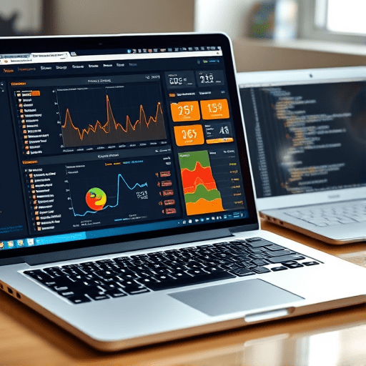
If you’ve ever wanted to scrape sports stats with Python and build a player dashboard that updates with live game data, free NBA APIs make the process easier than ever. In this beginner-focused tutorial, you’ll pull real player statistics from a publicly available endpoint, clean the data with pandas, and visualize game-ready metrics using interactive Plotly charts. By the end, you’ll have a working Python project that can track any NBA player’s performance over a season — no paid API keys or web scraping headaches required.
Why a Custom NBA Dashboard in 2026?
Off-the-shelf analytics dashboards are often locked behind paywalls or come with clunky interfaces. Building your own gives you complete control over the metrics that matter — whether that’s points per game, usage rate, or shooting efficiency by quarter. Plus, with the explosion of fantasy basketball and sports betting, having a live personal dashboard is a practical way to spot trends before they show up in mainstream media.
The technical stack you’ll use here is deliberately simple: Python, requests, pandas, plotly, and streamlit. All of these tools are free, well-documented, and run on any modern laptop. You don’t need a data science background, just a basic grasp of Python loops and functions.
Choosing the Right Free NBA Data Source
For this project, the balldontlie API remains one of the most reliable free options in 2026. It provides live NBA player statistics, game logs, and team standings without requiring authentication for low-volume requests. Another solid choice is the unofficial stats.nba.com endpoint, but it has stricter rate limits and requires custom headers. For a beginner, balldontlie’s clean JSON structure is ideal.
You’ll need to know your target player’s ID. For example, LeBron James has a player ID of 237. You can look this up via the API’s players endpoint. To keep the tutorial repeatable, we’ll use a player ID variable at the top of the script so you can swap in any athlete.
Setting Up Your Python Environment
Create a new virtual environment and install the required packages. Open your terminal and run:
python -m venv nba_dashboard
source nba_dashboard/bin/activate  # On Windows: nba_dashboard\Scripts\activate
pip install requests pandas plotly streamlit
That’s it. You’re ready to write the scraping script.
Fetching Live Player Stats with Requests
The balldontlie API exposes a /stats endpoint that accepts filters like player_ids[], seasons[], and postseason. Here’s a minimal Python function to pull a player’s season averages:
import requests

def fetch_player_season(player_id, season=2025):
    url = "https://www.balldontlie.io/api/v1/season_averages"
    params = {
        "player_ids[]": player_id,
        "seasons[]": season
    }
    response = requests.get(url, params=params)
    response.raise_for_status()
    data = response.json()
    return data["data"][0]
Notice the season_averages endpoint returns aggregated numbers such as points, rebounds, assists, and minutes per game. If you want game-by-game data instead, you can call /stats with per_page=100 and then paginate through the results. For our dashboard, season averages are enough to build a quick snapshot.
Cleaning and Structuring Data with Pandas
Once you have the JSON payload, you’ll want to wrap it into a data structure that’s easy to filter and chart. Pandas shines here. The following snippet converts a list of game logs into a tidy DataFrame:
import pandas as pd

def game_logs_to_frame(game_logs):
    rows = []
    for game in game_logs:
        rows.append({
            "date": game["game"]["date"],
            "pts": game["pts"],
            "reb": game["reb"],
            "ast": game["ast"],
            "blk": game["blk"],
            "stl": game["stl"],
            "fg_pct": game["fg_pct"],
            "min": game["min"]
        })
    df = pd.DataFrame(rows)
    df["date"] = pd.to_datetime(df["date"])
    return df.sort_values("date")
With this DataFrame, you can compute rolling averages, identify hot streaks, or compare a player’s home versus away performance. For a beginner project, simple column renaming and date parsing are enough to unlock deeper insights.
Visualizing Game-Ready Metrics with Plotly
Plotly is the best choice for interactive browser-based charts without needing a JavaScript frontend. You can embed a scatter plot of points per game over a season with only a few lines:
import plotly.express as px

fig = px.line(df, x="date", y="pts", title="Points per Game")
fig.update_traces(mode="lines+markers")
fig.show()
If you want to visualize multiple metrics together, use a bar chart for rebounds and assists or a dual-axis plot. Plotly’s hover tooltips make it easy to inspect specific game dates without cluttering the chart.
For fancier dashboards, you can add a slider to filter by date range or a dropdown to toggle between players. Plotly’s widgets module supports these controls natively.
Adding Dashboard Interactivity with Streamlit
To turn your script into a real live dashboard, Streamlit is the fastest route. Create a new file named app.py and combine your scraping and visualization functions inside a simple layout:
import streamlit as st

st.title("NBA Player Dashboard")
player_id = st.number_input("Player ID", value=237, step=1)
season = st.selectbox("Season", [2023, 2024, 2025, 2026])

season_avg = fetch_player_season(player_id, season)
st.metric("Points per Game", season_avg["pts"])
st.metric("Rebounds per Game", season_avg["reb"])
st.metric("Assists per Game", season_avg["ast"])
Run streamlit run app.py and you’ll see a live local web app that you can open in any browser. Streamlit automatically refreshes the data when you change the inputs, making it perfect for quick demos or personal use.
Going Deeper: Advanced Metrics and Fantasy Insights
Once the basic dashboard works, you can extend it with derived stats that are more game-ready. For instance, you can calculate per-36-minute averages to compare players with different playing times. Or you can add efficiency metrics like true shooting percentage (TS%) using the formula:
ts_pct = pts / (2 * (fga + 0.44 * fta))If you’re into fantasy basketball, the API also provides game-level data for rebounds and assists, which you can combine with category weights to generate a custom “fantasy score” for each day. That’s a great way to make your dashboard genuinely useful beyond just displaying raw stats.
Another approach is to pull the same data for multiple players and overlay their rolling averages on a single chart. This gives you a head-to-head comparison that’s far more compelling than a traditional stats table.
Conclusion
Building a live NBA player dashboard with Python is a rewarding project that teaches you real-world API consumption, data wrangling, and interactive visualization — all with free tools. Start with a single player and a couple of metrics, then gradually add features like season filtering, advanced rate stats, and multi-player comparisons. The skills you pick up here directly apply to any sports data project, so you’ll never be stuck staring at a static CSV again.