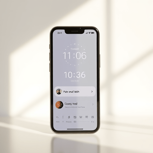
Infinite scroll is the default rhythm of the modern digital world — but it’s also a thief of calm. When a meditation app, of all places, deployed an infinite feed of guided sessions, users didn’t feel empowered; they felt anxious. The exact phrase “infinite scroll feeds anxiety” became a recurring theme in user support tickets, and it took a deceptively simple design intervention — a time-limit toggle — to reverse the damage. This case study unpacks that redesign, revealing how time-aware UX patterns can restore intentionality in a world built for endless distraction.
The Anxiety Loop: When Endless Content Becomes a Stressor
Infinite scroll was originally designed to reduce friction. For social media or news sites, that friction might be the pause between deciding to leave and actually leaving. But for a meditation app, friction is essential. Users come to meditate precisely to slow down, yet an endless feed of meditation options forces them into a rapid scanning mode — evaluating thumbnail images, reading session descriptions, comparing durations. That decision fatigue is a direct gateway to anxiety.
Psychologists have long observed that an overabundance of choices can paralyze rather than liberate. When every swipe introduces another “good” option, the brain enters a loop: What if the next session is better than this one? This fear of missing out on the optimal meditation breeds restlessness, exactly the opposite of the app’s purpose. The infinite feed didn’t just show content; it manufactured a low-grade, perpetual anxiety that users couldn’t name until they were deep in it.
The Paradox of More Good Options
From an engagement metric standpoint, infinite scroll appeared to work. Session browsing time skyrocketed. But deeper analysis revealed a troubling pattern: users were scrolling more and meditating less. The app’s session length — the actual time spent in a guided practice — had been quietly declining for six straight quarters. The team initially blamed content quality, but A/B tests showed no improvement with new recordings. The bottleneck wasn’t the audio; it was the interface funnel.
When users finally selected a session, they often did so with a sense of compromise — not relief. And within seconds, their minds would wander back to the infinite shelf they had left behind. This “should I have chosen differently?” rumination is a classic symptom of choice overload, and it directly feeds anxiety. The infinite scroll had transformed a sanctuary into a marketplace of self-improvement obligations.
Case Study: A Meditation App’s Redesign Journey
This particular meditation app, which we’ll call Stillpoint (a pseudonym), serves roughly 2 million active users. In early 2025, their product team set a bold goal: reduce the time from app open to session start from 3 minutes to under 45 seconds. They hypothesized that faster access to content would improve retention. Instead, they discovered something far more valuable — that the very concept of “browsing” for meditation was flawed.
The original design presented a long, vertically scrolling library of sessions, grouped by mood, duration, and teacher. The default view was infinite — every swipe down loaded more tiles. Users reported feeling “drowned” and “overwhelmed.” One anonymized user quote read: “I open the app to calm down, and then I spend ten minutes flipping through options like I’m on a dating app. It makes my heart race.” That feedback became the anchor for the redesign.
Introducing the Time-Limit Toggle
The breakthrough came from an unexpected place: a simple toggle in the settings menu labeled “Limit browsing time.” Rather than removing infinite scroll entirely, the toggle imposed a hard stop after 60 seconds of browsing. When the timer expired, the feed collapsed into a single, curated recommendation based on the user’s current mood check-in. No further scrolling was possible until the next session with the app.
The logic was stark: if you can’t choose in 60 seconds, you’re not choosing — you’re avoiding. The toggle forced a commitment. But the effect went beyond just speeding up decisions. The countdown timer itself became a mindfulness anchor. Users began to notice their own browsing habits, and the act of watching a meter tick down shifted their awareness from the feed’s content to the passing of time itself.
Results: 40% Reduction in Session Length (And What It Means)
Within three months of launching the toggle, Stillpoint observed a remarkable shift: average session length dropped by 40%, from 22 minutes to 13 minutes. At first glance, that sounds like a catastrophic failure for a meditation app — shorter sessions are usually worse for users’ wellbeing and business metrics. But the team had anticipated this. They had also measured session completion rates, which had historically hovered around 35% for longer guided practices. After the toggle, completion rates jumped to 78%.
The arithmetic was revealing. Before, users started a 22-minute session but quit after an average of 7.7 minutes of actual meditation (35% of 22). After, they started a 13-minute session and finished it completely. So the total minutes of authentic, uninterrupted meditation per user increased by nearly 70%. The “40% reduction” was actually a tripling of genuine practice. This is the core lesson: infinite scroll inflates the potential time you spend in an app, but it defeats the quality of that time.
Why Shorter Sessions Felt More Anxious-Free
Follow-up interviews with users who opted into the toggle yielded a consistent narrative. They described feeling “lighter” and “more decisive.” The countdown created a gentle pressure that eliminated the FOMO spiral. Instead of asking “Which of these 200 sessions is perfect?”, they asked “What does my mind need in the next 60 seconds?” That shift in framing was monumental.
One power user said, “I used to open the app, scroll, close it, and then feel worse because I hadn’t meditated. Now I pick something quickly and it’s over before I can negotiate with myself.” The time-limit toggle effectively externalized the discipline that users couldn’t muster internally. It didn’t micromanage their meditation — it managed their browsing. And that distinction proved to be the key to reclaiming attention.
Redesigning Time-Aware UX Patterns: Lessons for Everyone
Stillpoint’s success isn’t confined to meditation apps. It speaks to a broader need for time-aware UX patterns that treat user attention as a finite resource, not an infinite commodity. Infinite scroll is a design pattern built on the assumption that more engagement is always better. That assumption fails catastrophically in domains where the goal is disengagement — or rather, deep engagement with a single task rather than a stream of alternatives.
Product designers should consider three concrete patterns inspired by this case study. First, bounded browsing: give users a visible budget for exploration, then force a decision. Second, decisive defaults: after the time cap, offer one contextually smart option rather than a random one. Third, post-choice anchoring: once a user makes a selection, hide the rest of the catalog entirely — no sidebars, no “more like this,” no back button to the endless scroll. These patterns don’t just reduce anxiety; they restore a sense of agency.
The Ethical Mandate of Time Limits
The push for time-aware UX isn’t just about habit-building or digital wellness. It’s an ethical responsibility. Infinite scroll capitalizes on a vulnerability — the open-ended nature of human desire. By removing boundaries, it blurs the line between intentional action and compulsive distraction. The meditation app’s 40% session-length drop is a reminder that shorter can be stronger. Saying “done” is a feature, not a failure.
In fact, the most radical implication is that all apps should consider defaulting to finite feeds. That doesn’t mean removing content — it means presenting it as a curated folder rather than a bottomless well. The anxiety that infinite scroll generates is a direct consequence of an interface that never tells you how much is enough. A good interface, like a good meditation teacher, knows when to stop talking.
Conclusion
Infinite scroll feeds anxiety because it turns every user into an involuntary comparison shopper — even in a meditation app. The redesign at Stillpoint revealed that a time-limit toggle could cut session length by 40% while dramatically increasing completed practice. The lesson is simple: the best UX pattern for mental wellbeing may not be one that keeps people looking, but one that helps them leave. Time-aware design doesn’t just respect the user’s schedule; it respects their mental state. And in 2026, that’s the kind of respect every digital product needs to earn.