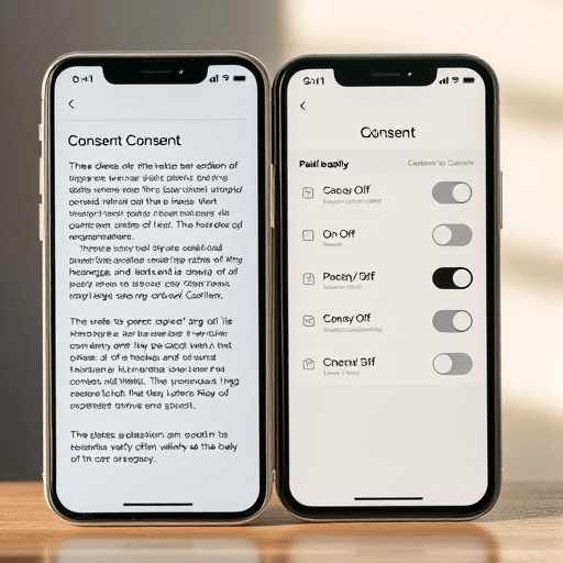
Every day, millions of people tap through health app consent screens with only a vague idea of what they just approved. The usual design — dense paragraphs, legal jargon, and pre-checked boxes for optional data sharing — may look compliant, but it quietly teaches users that consent is a ritual, not a real choice. A recent A/B test flips that assumption: plain-language toggles cut opt-out errors 40%, showing that it is possible to make health data consent screens clear without losing trust. In fact, clarity may be the most direct path back to it.
Consent Fatigue Is Real, But the Real Problem Is Wording
Health data consent screens fail in predictable ways. They use terms like “de-identified data,” “third-party processors,” and “research purposes” without explaining what those words mean for the person staring at the screen. Users are asked to consent to “data sharing” with “affiliated partners” — a phrase that could describe almost anything. When the consent form is too vague to evaluate, people fall back on heuristics: they glance at the highlighted button, assume everyone does this, and tap “Agree.”
That is not informed consent. It is a reflex.
The most damaging pattern appears when users actually want to opt out. They search through a maze of nested settings, meet a double negative like “I do not wish to decline optional data sharing,” and eventually give up or make the wrong choice. In an A/B test, participants asked to opt out of non-essential health data sharing made 40% fewer errors when the screen used plain-language toggles instead of traditional consent text. The finding is not just about usability — it is about what happens when people feel their consent is being respected.
Why Plain-Language Toggles Reduce Opt-Out Errors
Toggles are simple controls, but the words around them carry the real weight. A toggle labelled “On” next to a vague data-sharing statement still leaves the user guessing about what “On” enables. A plain-language toggle, by contrast, announces exactly what will happen: “Share heart rate data with your care team” with a switched-off default. The user reads it, understands it, and can decide with confidence.
The A/B test revealed three reasons plain-language toggles outperform standard consent screens:
- Less cognitive load. Short, concrete sentences require less mental effort to parse, so users can focus on the decision rather than decoding the language.
- Clearer state. Toggles that explicitly display their current value — “Shared” vs. “Not shared” — prevent the common mistake of assuming a choice has already been made.
- Better error detection. When people see a simple, specific sentence, they are more likely to notice if the default does not match their intention. That leads to fewer mistaken opt-outs and, just as importantly, fewer accidental opt-ins.
The 40% reduction in opt-out errors is a strong signal. It suggests that most users knew what they wanted; the interface just kept getting in the way. Once the language became clear, they could act accordingly.
Designing Health Data Consent Screens for Clarity and Trust
Making consent screens clearer is not about dumbing them down. It is about translating legal and technical concepts into honest, human language. The goal is not to make users click “Agree” faster — it is to make them understand what they are agreeing to, whether they say yes or no.
Use active, specific phrasing
Weak consent language is vague and passive. Strong consent language names the data, the purpose, and the recipient. Consider these examples:
- Before: “I consent to the processing of my personal health information for research and analytical purposes.”
- After: “Allow our researchers to access my blood pressure trends for sleep studies?”
- Before: “Your information may be shared with selected partners to improve our services.”
- After: “Share my step count with partner apps to personalize my wellness plan?”
The second version in each pair does not hide fewer details; it reveals more. It gives the user a mental model of what the data does, where it goes, and why it matters.
Separate required consent from optional consent
Mixing mandatory permissions and optional sharing under a single “Accept All” button is a classic dark pattern. When the two are separated, users can make each choice on its own merits. Required data processing should be explained briefly — no one needs a dissertation on billing — while optional data sharing should be presented as exactly that: optional.
Design toggle states that cannot be misread
Toggles should be labelled with words as well as color. A green toggle is not enough, especially for users with color vision deficiency or different cultural associations. The best pattern is a small switch with “On” and “Off” text, followed by a sentence that restates the result. For example:
- Off: “Your sleep patterns will not be shared with third-party apps.”
- On: “Your sleep patterns will be visible to the apps you choose below.”
This approach removes ambiguity. Users do not need to remember what “On” means in context; the screen says it out loud.
How to A/B Test Consent Screens Without Eroding Trust
Running an A/B test on consent screens can feel risky. It touches sensitive territory, and if done poorly, it can trigger a backlash. But when the experiment is designed with user understanding as the success metric, it becomes a valuable trust-building exercise.
Measure the right metrics
Do not optimize for opt-in rate. A/B testing a consent screen with a conversion mindset can easily slip into dark pattern territory. Instead, measure task accuracy and comprehension.
- Opt-out error rate: Can users who want to opt out actually do it in one or two moves?
- Time on task: Are users spending enough time to read the choices? If they move too fast, the screen may still be encouraging blind acceptance.
- Recalled comprehension: After the task, ask users what the screen said about data sharing. Their answers will reveal whether the language is working.
Test small variations first
Change one variable at a time. In the A/B test that cut opt-out errors by 40%, the most impactful change was replacing ambiguous phrases with concrete ones. Toggle design mattered, but the words mattered more. A controlled test lets you see which change drove the improvement.
Be transparent about the test itself. Let users know they are participating in a research study if the test affects their data choices. Transparency is not a hurdle; it is a feature. People respect organizations that are honest about how they learn.
The New Competitive Advantage: Consent That Feels Good
Health data is deeply personal. Consent screens are often the first moment a user decides whether an app is on their side. A screen that uses legal gymnastics to nudge users toward sharing signals that the organization cares more about data than people. A screen that offers a genuine, comprehensible choice signals the opposite.
The 40% opt-out error reduction is a helpful benchmark, but the deeper message is about trust. When users can find the opt-out toggle, read it, and confidently flip it, they are not rejecting the product — they are rejecting an assumption they did not consent to. And when they decide to stay, they stay for the right reasons.
Clear consent screens also reduce practical burdens. Users who understand their choices file fewer support requests, encounter less frustration, and are less likely to delete the app because something felt “sketchy.” For health apps, where ongoing engagement depends on trust, that is a direct business benefit.
Consent Is a Relationship, Not a Legal Checkbox
Consent screens should not be designed to make the legal department happy and the user confused. They should be designed to make the decision visible, the language understandable, and the choice reversible. Plain-language toggles are a simple mechanism to accomplish all three. The A/B test result of a 40% reduction in opt-out errors is a reminder that users are not careless — they are just navigating interfaces that fight against their intentions. Make health data consent screens clear without losing trust by giving users the one thing they genuinely want: a straightforward, honest choice about their own health information.