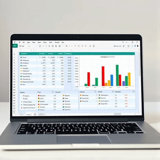
If you are managing an amateur soccer, basketball, or volleyball team in 2026, you already know the drill: scouting reports, practice logs, and game stats are piling up, but the time to make sense of it all never seems to exist. The good news is that Excel for sports stats track performance on a budget without expensive software subscriptions or a data science degree. With a handful of pivot tables and free templates, you can turn a messy spreadsheet into a player metrics dashboard that actually informs your next practice plan.
Why Amateur Teams Are Ditching Expensive Analytics Tools
The landscape of sports analytics has changed. Professional franchises spend thousands on custom dashboards, but the amateur level demands something leaner. A volunteer coach or weekend organizer in 2026 needs answers fast—who is logging the most minutes, which player struggles under pressure, and how does each athlete’s output trend over the season? Paid tools often come with a steep learning curve and yearly fees that eat into a team’s already tight budget. Meanwhile, Excel has quietly become a powerhouse for performance tracking, thanks to modern features like dynamic arrays and Power Query. You do not need a staff of analysts; you need a well-structured workbook and a willingness to experiment.
Setting Up Your Player Metrics Dashboard from Scratch
Collect the Right Data Without Extra Gear
Before you can build anything, you need data that reflects what actually happens on the field or court. Amateur teams often lack wearable sensors, but simple hand-tracking works perfectly. Create a shared data entry sheet with columns for date, opponent, player name, position, minutes played, plus two or three performance metrics that matter for your sport. For soccer, that might be goals, assists, and successful passes. For basketball, shoot for points, rebounds, and turnovers. The secret is to keep it small—a dataset with more than 20 columns becomes a chore to fill in, and entries start to get skipped.
To avoid manual errors, use Excel’s data validation feature to create dropdown lists for player names and positions. That ensures consistency when you later build pivot tables. Also, store every game in one flat table, with one row per player per game. This “tidy” structure is the foundation for any flexible metrics dashboard.
Build a Clean Data Table in Excel
Once your raw data is in place, convert it to a real Excel table using Ctrl+T. This simple step gives you automatic filtering, a named range, and—most importantly for your dashboard—the ability to refresh pivot tables with a single click as you add new game data. In 2026, Excel also supports dynamic arrays that spill results across cells, so formulas like UNIQUE and FILTER can instantly turn your raw table into a dynamic player list without manual dragging.
Your core table should never contain merged cells, empty columns, or duplicate headers. Stick to plain column names: Game Date, Opponent, Player ID, Metric 1, Metric 2, etc. The cleaner the input, the more reliable your pivot table outputs.
Using Pivot Tables to Unlock Performance Trends
Pivot tables are the heart of your budget-friendly performance tracking. They let you group, aggregate, and compare data in ways that are impossible with simple formulas. Start with a basic pivot table that shows each player’s total minutes and key stats across the season. Drag Player ID to the Rows area, and drag Minutes Played and your performance metrics to the Values area. Excel will automatically sum them. Now you instantly see your team leaders and spot players who might be underutilized.
The real power emerges when you add multiple layers. For instance, place Opponent in the Columns area and Player ID in Rows to compare performance against strong versus weak opponents. Or add Game Date as a filter to examine a specific month. For a per-game average, change the value field settings from Sum to Average—critical when players have different total minutes. This lets you track efficiency, not just raw volume.
Add a Second Pivot Table for Game-Level Context
One pivot table rarely tells the whole story. Build a second one that summarizes team performance by game, using Game Date as rows and sums of your key stats as values. This table reveals scoring streaks, defensive collapses, and whether your team’s results improve as the season progresses. You can then link both pivot tables to the same source data, and since they are from the same table, refreshing one updates all.
Free Templates and Resources to Accelerate Your Setup
If you do not want to build everything from a blank workbook, there are excellent free templates floating around. Microsoft’s official template gallery includes sports team rosters and practice planners, but for a true metrics dashboard you may need to customize. Search for Excel templates tagged “sports stats,” “player tracking,” or “performance dashboard.” Many amateur coaches share their own versions on sites like GitHub or sports coaching blogs, and those are perfect starting points.
Another budget trick is to download a simple project management template and repurpose its dashboard tabs. Pivot charts, conditional formatting, and slicers are all standard components you can adapt. Slicers in particular give your dashboard an interactive feel—add one for position or season month, and anyone on the coaching staff can filter the view without touching the data.
Advanced Tips for Making Your Dashboard Actually Useful
- Use conditional formatting for instant red flags. Highlight players whose minutes average is dropping, or turn cells red when a performance metric falls below a certain threshold. Visual cues beat scrolling through numbers.
- Set up a “last updated” cell. Since amateur teams often have volunteers entering data, a simple date stamp helps avoid confusion about whether the stats are current.
- Leverage named ranges in your pivot tables. When you add new rows to your data table, an Excel table automatically expands, and your pivot table can be refreshed with Alt+F5. No retraining needed.
- Create a simple trend chart for each player. A pivot chart based on your pivot table can show weekly performance lines. You do not need fancy charting; a line chart with a moving average is enough to spot slumps.
- Protect your input sheet. If multiple people are entering data, lock everything except the data entry columns. That prevents accidental overwrites that ruin your entire dashboard.
These small touches turn a raw spreadsheet into a tool that supports decisions during halftime, not just a record after the season ends. Remember that accuracy matters more than elaboration—a dashboard with three clean metrics beats one with fifteen noisy ones.
The 2026 Edge: Excel’s Free Features That Replace Paid Tools
The biggest misconception is that advanced sports analytics require specialized software. In 2026, Excel’s integrated AI and dynamic formulas make it easier than ever to ask natural-language questions about your data, such as “Which player has the most assists in away games?” Without spending a dime, you can build a dashboard that rivals entry-level commercial platforms. For amateur teams with tight budgets, this means more resources go to equipment, travel, and player development—not software licensing.
Another advantage is mobility. Excel Online is free for personal use, so coaches can update game stats from a phone immediately after the final whistle. Sync your workbook to OneDrive, and your assistant coach can pull up the dashboard on a tablet during training. The simplicity of shared Excel files keeps the whole team aligned without forcing everyone to learn a new platform.
In the end, building a player metrics dashboard with pivot tables and free templates gives you exactly what an amateur team needs: clarity, speed, and insight without the financial strain. Start with a modest dataset, let your pivot tables uncovered patterns, and refine your metrics as the season unfolds. The goal is not to become a stat-obsessed club; it is to use the data you already have to help every player improve—one confident coaching decision at a time.