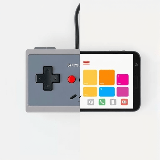
Nostalgia is a powerful engagement tool, especially in 2026, when digital experiences feel increasingly uniform and polished. But the quickest way to destroy a modern product is to slap on a pixel font, a cassette-tape icon, and call it a day. The real challenge is knowing how to add retro feel without sacrificing modern UX—how to make an interface feel warmly familiar, playful, or even a little chunky, while keeping it fast, accessible, and frictionless. The answer lies in three underappreciated design levers: audio cues, limited palettes, and physics quirks. Each one lets you inject personality at a sensory level, without disrupting the usability principles that keep users coming back.
The Three Levers: A Different Way to Think About Nostalgia
Most retro design attempts focus on visuals—crt scanlines, beveled buttons, or VHS noise. Those cues work, but they’re also the first ones users complain about when they interfere with readability or task completion. Instead, consider the levers below. They operate on the periphery of attention, creating a distinct texture without compromising clarity.
Audio Cues: The Most Underrated Nostalgia Carrier
Sound is an emotional shortcut. A classic 8-bit blip or a soft synth chord can evoke an entire decade in milliseconds. The key is to use audio sparingly and purposefully. For instance, a subtle arpeggio when a user completes a transaction, or a soft “pop” when toggling a switch, adds a layer of retro charm without requiring users to read a single extra pixel.
Important, though: audio must be controllable, with clearly visible mute toggles, and it should respect the user’s system sound settings. Modern UX abhors an interface that speaks without permission. So keep sound effects short, non-repetitive, and always accompanied by a visual indicator—so the experience is just as satisfying for deaf or hard-of-hearing users.
Limited Palettes: Constraint as a Liberation
Early game consoles had hard color limits—the NES, for instance, could only display 25 colors simultaneously. That restriction gave games a cohesive, iconic look. Modern interfaces rarely impose color limits, and the result is often noise. By deliberately limiting your palette to one dominant hue, one accent, and one neutral, you get the retro feel of a coherent universe. Think of a duck-egg teal background, burnt orange accents, and a warm off-white for text. The palette feels vintage, or at least evocative, but the contrast ratios are perfectly modern, and users’ eyes get an immediate sense of hierarchy.
Physics Quirks: The Joy of the Unexpected
This is the lever that separates memorable retro experiences from mere skins. Retro games had “physics” that were wrong by modern standards—skidding, bouncing, momentum, gravity that feels too floaty or too snappy. You can translate this into UI micro-interactions. A button that doesn’t just depress, but springs with a slight overshoot—like an old trackball clicking into place. A toast notification that slides in with a tiny anticipatory backward bump, as if it’s getting traction on ice. These tiny moments of imperfect motion trigger the same fondness as an old platformer, while remaining smooth and responsive because they’re short, subtle, and don’t block the main interaction.
Audio Cues: Making Them a Feature, Not a Bug
Retro sound design isn’t simply about what you play, but when you play it. The most satisfying retro games gave audio feedback for nearly every action—jumping, landing, collecting a coin. Modern UX can borrow this principle without falling into the trap of over-stimulation. Treat audio as a confirmation layer only. A subtle tick when a filter is applied, a friendly “return” blip when a form resets, a low hum during a long-running background process—all signal status changes without demanding visual attention.
Sonic branding also helps. A distinctive, short melody at app launch (or when a user returns after a long absence) can trigger nostalgia faster than any visual logo. But remember: modern UX is also about user autonomy. Provide sound themes—not just on/off, but options like “Retro Blips” or “Soft Chimes.” That choice alone becomes a delightful engagement moment.
Limited Palettes: How to Choose and Apply Them
To build a limited palette for a retro-but-modern feel, start with three colors: a background, a primary surface, and an accent. Add one more for errors or high-emphasis actions only. Avoid gradients that try to simulate 3D bevels; the flat, constrained look of early 8-bit games is actually closer to modern Material Design than people think. That’s why the two aesthetics can coexist.
Apply the accent sparingly—use it for links, call-to-action buttons, and progress indicators. The rest of the interface should live in neutrals. This approach has a dual benefit: it gives the interface a distinctive retro personality and improves usability by making important interactive elements instantly scannable. Users who remember classic terminals or the Game Boy’s olive-green screen will feel a twinge of familiarity; younger users just see a calm, focused interface.
A helpful exercise is to design the entire UI in grayscale first, then introduce your single accent color. If the interface remains clear without it, you’ve built a solid limited palette. Then, add the accent as a reward for accomplishment—filling out a form correctly, reaching a milestone—so it becomes associated with positive feedback, much like a power-up in an old game.
Physics Quirks: Subtle, Not Old-chool Annoying
The boundary between a satisfying physics quirk and an annoying obstruction is the duration and the damping. A good physics quirk should be short (under 300 milliseconds), have elastic easing, and never delay a user’s next action. For example, when a user dismisses a card, it could shrink and do a little “spin out” before disappearing—like a coin being knocked away in Sonic. The animation is fast enough that it feels responsive, but the tiny curved path adds a moment of wonder.
Another favorite is “inertia on scroll.” If you have a horizontal carousel, give it a slight amount of momentum—let it drift for a few pixels after the user’s finger or mouse lifts. This mimics the feel of a mechanical scroll wheel or an old Jog dial. But please, resist the temptation to make scrolling through the whole page bouncy or physics-heavy. That disorients users and breaks modern usability expectations. The quirk should live in narrow, functional areas where causing a smile beats pure efficiency.
Avoiding the Gimmick Trap: When Nostalgia Hurts Usability
Even the best-meaning retro design can alienate users if it compromises core functionality. Here are a few danger zones and how to sidestep them:
- Scanline overlays and CRT flickers: They cause eye strain and headaches. If you want the vibe, use a very subtle static texture on the border, never over the text or main images. Provide a “reduce motion” setting that kills all flicker effects.
- Pixel-perfect fonts: Pixelated letterforms are hard to read at small sizes. Use a modern, highly legible font, but wrap it in a chunky, pixel-styled container, or use a retro font for labels and badges, keeping body text clean.
- Deliberately slow interactions: Old software often felt slow due to hardware constraints, not design intent. Don’t recreate that. A 500ms loading screen with a fun progress bar is charming only the first eleven times. Make it skippable and always let the user feel in control.
- Obscure iconography: Floppy disk icons are still understood, but a 56k modem icon is not. If you use retro metaphors, place a modern tooltip or label next to them.
These guardrails ensure that you evoke, rather than simulate, the retro era. The goal is to make the user feel a fleeting sense of wonder, not to trap them in a historical simulation with bad usability.
Measurement: Does It Actually Improve the Experience?
The best way to validate your retro-modern blend is to watch real users. Use session recordings and heatmaps. If you notice users hovering longer on buttons with retro sound cues, or if you see more repeated visits from users who customize their audio themes, you’ve made the right call. Conversely, if users toggle off the sound or reduce motion within the first minute, you’ve made the experience too aggressive.
Also, measure task completion time. Retro touches should not add more than a fraction of a second to key flows. If they do, simplify. The “retro feel” should be a layer on top of solid UX, not a restructuring of it.
Conclusion
Adding a retro feel to a modern product doesn’t require sacrificing clarity, speed, or accessibility. By leaning on audio cues, limited palettes, and physics quirks, you can create a user interface that feels like a fond memory—yet behaves like a 2026 app. Each of these levers gives users a sensory hook that transforms the interface from a tool into a place, and with the right restraint, it’s a place they’ll want to revisit.