
In the hyper‑competitive SaaS landscape of 2026, staying ahead means having your unit economics on a live, automated dashboard that feeds directly into strategic decisions. This guide shows you how to build a Google Data Studio dashboard that pulls data from your billing system, churn analytics, and customer success tools, then visualizes the KPIs that matter most to ARR growth. By the end, you’ll have a fully automated, real‑time view of MRR, LTV, CAC, churn, and more – all in one place.
1. Define the Core KPIs for Your SaaS Unit Economics
Before you dive into connectors and queries, identify the metrics that drive your business model. Typical unit economics KPIs include:
- Monthly Recurring Revenue (MRR) – the predictable revenue stream.
- Annual Recurring Revenue (ARR) – MRR scaled up to a year.
- Customer Acquisition Cost (CAC) – marketing spend divided by new customers.
- Lifetime Value (LTV) – projected revenue per customer.
- Churn Rate – percentage of customers lost monthly.
- Gross Margin – revenue minus direct costs.
- Monthly Cohort LTV – LTV broken down by acquisition month.
Document each KPI’s calculation formula and data source. This blueprint will guide the data model and visualizations.
2. Gather Data Sources and Set Up Secure Connections
In 2026, most SaaS companies use a combination of Stripe, HubSpot, Intercom, and a proprietary database for billing. Google Data Studio supports connectors for these platforms, but you’ll need to standardize data formats first.
2.1 Stripe → BigQuery
Export transaction and subscription events to BigQuery using the Stripe BigQuery Export feature. Create a daily table that captures:
- Subscription ID, customer ID, plan ID, start/end dates.
- Current price, discounts, tax rates.
- Payment status and failures.
2.2 HubSpot → Google Sheets
Use HubSpot’s API to pull contact and deal data into Google Sheets. Map each lead to its associated Stripe customer ID for later joins.
2.3 Intercom → CSV via Zapier
Schedule a Zap that exports user activity logs (e.g., feature usage, support tickets) into a CSV file stored in Google Drive. This file will feed into cohort analysis.
3. Build the Data Model in Google Data Studio
Data Studio’s “Data Source” editor allows you to blend multiple tables. Start with the core MRR table from BigQuery.
3.1 Create Calculated Fields
Define fields for each KPI directly in Data Studio:
Monthly Recurring Revenue (MRR) = SUM(Price * Quantity)Churn Rate = COUNT(Closed Lost) / COUNT(Current Customers)CAC = SUM(Marketing Spend) / COUNT(New Customers)LTV = MRR / Churn Rate
3.2 Blend Data for Cohort Analysis
Use the “Blend Data” feature to join the Stripe subscription table with Intercom activity logs on customer ID. Then create a new field: Cohort Month = DATE_TRUNC(Subscription Start Date, MONTH).
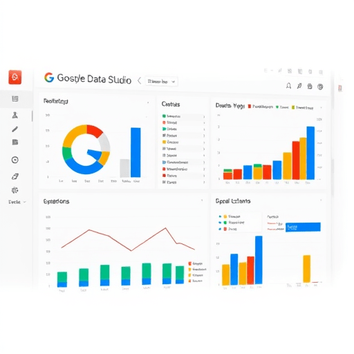
4. Key Visualizations for Unit Economics
Design your dashboard to give a quick snapshot of health and growth potential.
4.1 ARR and MRR Trend Line
Plot ARR and MRR over the last 24 months. Use a smooth line chart with a moving average overlay to highlight momentum.
4.2 CAC vs. LTV Ratio
Display a bar chart comparing CAC to LTV. Add a threshold line at 3:1 to indicate healthy unit economics.
4.3 Churn Funnel
Show a funnel of customers at each stage: New, Active, Churned. Color-code the churned segment in red to alert the team.
4.4 Monthly Cohort LTV Heatmap
Use a heatmap to visualize LTV across acquisition months. Darker cells indicate higher LTV, allowing you to spot which cohorts are most profitable.
5. Automate Data Refreshes and Alerting
Data Studio automatically refreshes BigQuery tables on a scheduled basis (up to 1‑hour intervals). To keep Google Sheets and CSV files fresh, set up Zapier triggers that push updates to Google Drive every 12 hours.
For real‑time alerts, create a Data Studio report that includes a Metric Alert component. Set thresholds for critical KPIs (e.g., Churn > 5% triggers an email to the CRO).
6. Advanced Features for 2026 SaaS Dashboarding
6.1 Predictive LTV Forecasting
Integrate a TensorFlow model via BigQuery ML to forecast LTV based on historical usage patterns. Add a line chart that shows actual vs. predicted LTV for each cohort.
6.2 Feature Adoption Correlation
Use Intercom activity logs to map feature usage to churn events. Create a scatter plot with Feature Adoption Score on the X‑axis and churn likelihood on the Y‑axis to identify high‑impact features.
6.3 Elastic Search for Fast Searchability
Store raw event logs in Elastic Search and use Data Studio’s Elastic Search Connector to pull custom queries, enabling ad‑hoc analysis without re‑processing large datasets.
7. Troubleshooting Common Issues
- Data Lag – If you notice a 1‑day lag, confirm that BigQuery tables are refreshing on schedule and that your Zapier jobs are not throttled.
- Missing Customers in Cohort Heatmap – Ensure that the customer ID field is consistent across Stripe, HubSpot, and Intercom.
- Inaccurate LTV Calculations – Verify that churn rate is calculated on a consistent basis (e.g., 12‑month churn vs. monthly).
8. Wrap‑Up and Next Steps
By following these steps, you’ve built a live, automated dashboard that gives you a real‑time view of your SaaS unit economics. The integration of predictive analytics, feature adoption insights, and automated alerts turns static numbers into actionable intelligence. Keep refining your metrics, experiment with new data sources, and stay agile—those are the keys to sustaining ARR growth in 2026 and beyond.