
In the high-stakes world of early-stage fundraising, every visual cue counts. A well-chosen color palette can convey stability, innovation, and ambition—signals that angel investors interpret before they even read your business plan. This article explores how to harness data to craft color schemes that resonate with investors’ risk appetite, turning your pitch deck into a subtle, persuasive language of growth.
Understanding Investor Risk Appetite Through Color Preferences
Angel investors vary along a spectrum of risk tolerance, from the cautious, preferring incremental gains, to the bold, chasing disruptive breakthroughs. Data shows that color preferences correlate strongly with these tendencies. Studies in behavioral finance reveal that risk-averse investors gravitate toward muted, cool hues that suggest reliability, while risk-seeking investors favor vibrant, warm tones that signal dynamism.
By mapping investor demographics and historical investment portfolios to color psychology, you can quantify which palettes are most likely to resonate. For example, a cohort of investors who predominantly fund fintech and SaaS startups—a sector known for rapid scaling—tends to respond positively to balanced combinations of teal and gold, which blend trust with ambition.
Psychology of Color in Venture Capital
Color psychology offers a robust framework for understanding how hues affect perception. Blue, often linked to trust and professionalism, can lower the perceived risk of a proposal. Green’s associations with growth and prosperity make it an ideal accent for metrics and forecast charts. Orange and red, when used sparingly, inject urgency and excitement without compromising credibility.
When tailoring palettes for angel investors, consider the following evidence-backed color triggers:
- Blue (HEX #0066A2): Conveys reliability, perfect for foundational data.
- Green (HEX #4CAF50): Signals growth, ideal for charts and KPI highlights.
- Teal (HEX #009688): A modern twist on blue, appealing to tech-savvy investors.
- Gold (HEX #FFC107): Evokes success and premium positioning.
- Charcoal (HEX #333333): Offers a neutral backdrop that allows other colors to stand out.
Collecting and Analyzing Color Preference Data
To move beyond theory, gather empirical data from the very investors you aim to attract. Start with a structured survey that presents a series of color palettes and asks respondents to rank them on relevance, professionalism, and excitement. Combine these rankings with secondary data: investment size, stage, industry focus, and historical performance.
Statistical techniques such as cluster analysis can segment investors into distinct risk profiles. Visualize these segments using heatmaps that show which colors receive the highest approval in each cluster. This data-driven approach ensures that your palette choices are not based on guesswork but on measurable investor sentiment.
Building a Color Palette from Data Insights
Once you have your data, translate insights into a cohesive palette. Here’s a step-by-step framework:
- Define the core color: Select a shade that aligns with the majority of investors’ preference in your target cluster. For a growth-focused cohort, teal often emerges as the dominant choice.
- Add an accent for KPI emphasis: Green or gold can highlight key metrics without overwhelming the design.
- Introduce a neutral base: Charcoal or deep gray provides balance, ensuring the deck remains legible and professional.
- Apply accent tones sparingly: A touch of orange or crimson can signal urgency in calls to action or milestones.
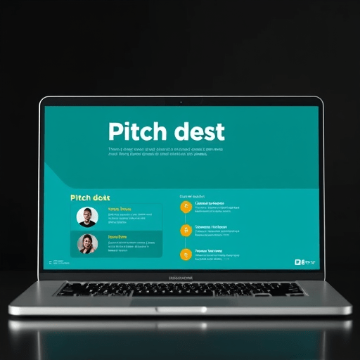
Example palette for a tech SaaS startup:
- Primary: Teal (#009688)
- Accent 1: Green (#4CAF50)
- Accent 2: Gold (#FFC107)
- Neutral: Charcoal (#333333)
- Highlight: Orange (#FF5722)
Implementing the Palette in Pitch Materials
Consistency is critical. Apply the chosen palette across all visual assets: slides, infographics, logo, and website mockups. Use the primary color for headings and backgrounds, the accents for data points and callouts, and the neutral for body text. This uniformity signals a polished, thoughtful brand—an essential attribute for angel investors.
When designing charts, overlay green bars or teal lines to keep the data visually linked to the palette. Use gold sparingly on critical milestones or achievements to draw attention without diluting impact.
Testing the Palette with Investor Feedback
Before finalizing, conduct a blind test with a small group of investors or mentors. Show two decks: one with a generic palette and one with your data-driven palette. Collect qualitative feedback on perceived trustworthiness, excitement, and overall appeal. Quantify responses and compare them to your initial data. If the data-driven deck consistently scores higher on growth perception, you have validated your approach.
Tools and Resources for Data-Driven Color Selection
Leveraging technology can streamline the process:
- Google Forms or Typeform: For collecting investor color preference data.
- Tableau or Power BI: Visualize clusters and heatmaps.
- Adobe Color: Build and test palettes with harmony rules.
- Canva’s Brand Kit: Apply palette across slide templates.
- Looker Studio: Monitor investor engagement metrics post-launch.
For ongoing refinement, consider integrating a feedback loop that updates your palette based on new investor data each funding cycle.
Conclusion
Data-driven color palettes are more than aesthetic choices; they are strategic tools that communicate risk appetite, growth potential, and brand credibility to angel investors. By grounding your palette decisions in empirical investor preference data, you can craft decks that resonate on an intuitive level, increasing the likelihood of securing that critical first investment.