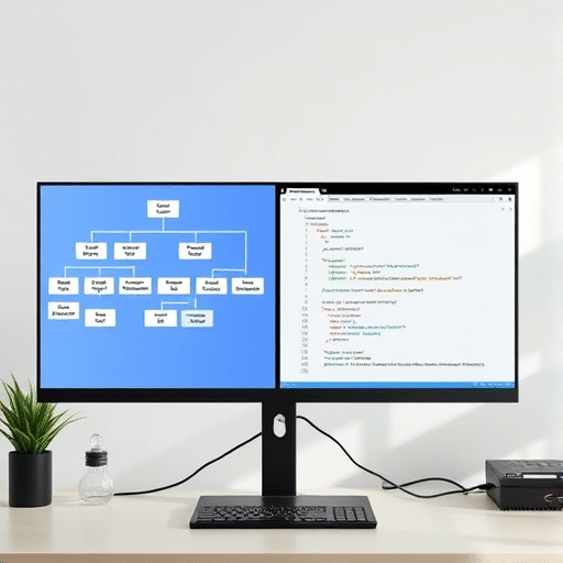
If you are learning front-end development and want to build a custom portfolio slider using HTML, CSS, and JavaScript for beginners, this tutorial walks you through the entire process from scratch. A well-designed slider can showcase your projects, photography, or design work in a compact, interactive space, and creating one yourself teaches you the core mechanics behind nearly every carousel you see online. By the end of this article, you will understand how to structure the markup, style slides with smooth transitions, and add JavaScript controls that work beautifully on phones, tablets, and desktops.
Why Build a Custom Portfolio Slider Instead of Using a Library?
Third-party slider libraries are convenient, but they often come with hundreds of lines of CSS and JavaScript you did not write. When you build one yourself, you control the file size, the visual style, and the behavior. More importantly, you learn how transitions, transforms, and event listeners actually work. These are foundational skills that transfer to animations, modal windows, and interactive components throughout your career.
For a beginner portfolio, a handcrafted slider also signals to potential clients and employers that you understand the fundamentals. It demonstrates that you can deliver a polished result without leaning on dependencies, a quality that stands out in a crowded job market.
Planning the Slider Structure
Before writing any code, it helps to sketch what the slider will contain. A clean, responsive portfolio slider typically includes:
- A container that holds all slides and clips overflow.
- A track element that holds the slides in a single horizontal row.
- Individual slide items, each containing an image and optional caption.
- Navigation arrows for previous and next controls.
- Dot indicators showing the current slide position.
Thinking through this structure first prevents the common beginner mistake of mixing layout and logic. Once the structure is clear, the styling and JavaScript become much easier to manage.
Writing the HTML Markup
Start with semantic HTML that is easy to read and accessible. Each slide will live inside a wrapper, and the entire carousel will sit inside an outer container.
A simplified version of the markup looks like this. Notice how each slide contains an image and a caption, and the controls live outside the track so they remain fixed in position.
<div class="slider">
<div class="slider-track">
<div class="slide">
<img src="project-one.jpg" alt="Project One preview">
<h3>Project One</h3>
<p>Brand identity for a local coffee shop.</p>
</div>
<!-- additional slides -->
</div>
<button class="prev" aria-label="Previous slide">←</button>
<button class="next" aria-label="Next slide">→</button>
<div class="dots"></div>
</div>
Adding aria-label attributes on the navigation buttons is a small touch that improves accessibility for screen reader users, an important habit to build early.
Styling the Slider With CSS
The CSS is where the slider comes together. The key idea is to make the track wider than the visible area and then translate it horizontally to reveal each slide. This approach is smoother than animating the width of individual slides and works reliably across browsers.
Start by setting the slider container to a fixed width with overflow: hidden. This clips any content that scrolls outside the visible area, which is what gives the slider its windowed appearance.
Creating Smooth Transitions
Smooth transitions are the difference between a slider that feels polished and one that feels jerky. Use the CSS transition property on the track element to animate changes to the transform property. This leverages the browser’s GPU acceleration and produces fluid motion even on mid-range mobile devices.
A practical approach is to set the transition duration to around 0.5 seconds with an easing function like ease-in-out. Anything faster can feel abrupt, while anything slower feels sluggish.
Making the Slider Responsive
Responsive design is essential for a portfolio slider. Visitors will view your work on phones, tablets, and desktops, and the slider must adapt gracefully. Use relative units like percentages instead of fixed pixel widths for the slide items.
A common pattern is to set each slide to take up 100% of the container’s width. This guarantees that exactly one slide is visible at any given breakpoint. Combine this with a media query that adjusts the caption font size and button size on smaller screens, and your slider will feel native on every device.
For touch devices, adding the CSS property -webkit-overflow-scrolling: touch helps ensure smooth momentum scrolling on iOS, although in this custom build we are handling movement through JavaScript instead.
Adding JavaScript Controls
With the markup and styles in place, the JavaScript brings the slider to life. The logic is straightforward: keep track of the current slide index, update the track’s transform position when the index changes, and update the dot indicators to match.
Tracking the Current Slide
Begin with a variable that stores the current index, starting at zero. Create a function that calculates the offset needed to move the track to the correct slide. For a slider with one slide visible at a time, the offset is simply the negative of the current index multiplied by 100 percent of the container width.
This separation between state (the index) and presentation (the transform) is a clean pattern that scales well. If you later decide to show multiple slides at once or add vertical scrolling, only the offset calculation needs to change.
Wiring Up the Navigation Buttons
Attach click event listeners to the previous and next buttons. When clicked, increment or decrement the index, then call the update function. To prevent bugs at the ends of the slide list, wrap the index using the modulo operator or clamp it within bounds depending on whether you want looping behavior.
Looping is generally preferred for portfolio sliders because visitors expect to keep clicking without reaching a dead end. The modulo approach makes looping automatic and concise.
Generating and Updating Dot Indicators
Dots give visitors a clear sense of position and let them jump to a specific slide. Generate them dynamically in JavaScript by creating one button per slide and appending it to the dots container. Add an active class to the dot that matches the current index, and remove it from all others.
This pattern of generating UI dynamically based on data is something you will use throughout your development career, in everything from dropdown menus to dynamic tables.
Adding Touch and Keyboard Support
Touch gestures and keyboard navigation are no longer optional. Mobile visitors expect to swipe, and keyboard users expect to tab through controls. Add touchstart and touchend event listeners to detect horizontal swipes, and listen for arrow key presses on the document to advance the slider.
These additions are surprisingly small in code but make a meaningful difference in how professional the slider feels.
Performance Tips and Common Pitfalls
Once the slider works, a few refinements elevate it from functional to impressive. Lazy load images by setting the loading="lazy" attribute on each img tag. This defers loading off-screen images until they are needed, which speeds up initial page load significantly on image-heavy portfolios.
Avoid animating properties that trigger layout recalculation, such as width or margin. Stick to transform and opacity for the smoothest results. If the slider stutters on lower-end devices, reduce the transition duration or simplify the box shadows on slides.
Another common pitfall is forgetting to reset the index when the window resizes. If your layout changes between breakpoints, the visible slide may no longer align with the transform offset. Listening for the resize event and reapplying the current index solves this elegantly.
Conclusion
Building a custom portfolio slider from scratch is one of the most rewarding beginner projects you can tackle. It combines semantic HTML, modern CSS techniques, and practical JavaScript patterns into a single, visible result you can proudly show off. More importantly, the concepts you practice here, transforms, transitions, event listeners, and responsive layouts, appear in nearly every interactive component you will build in the future. Take this foundation, experiment with different transition styles, add autoplay if you want, and most importantly, make it your own. Your portfolio deserves a slider built by you, for you.