In 2026, the conversation in digital health is no longer about whether a product is HIPAA compliant. Compliance is the floor, not the ceiling. What separates the platforms patients actually stick with from those they abandon after one privacy scare is something subtler: granular consent UX — the way an app or portal lets users choose, in plain language, exactly what data is collected, how it is used, and with whom it is shared. As regulators tighten rules and consumers grow more skeptical of health tech, designing consent as a thoughtful experience rather than a legal checkbox has become a genuine competitive edge.
Why HIPAA Was Never Enough
HIPAA, signed into law in 1996, was built for a world of paper charts, clearinghouses, and siloed hospital networks. It defines how covered entities handle protected health information, but it says very little about the user interface through which patients encounter data practices. A consent form can be HIPAA compliant and still be unintelligible, one-size-fits-all, or buried behind a 40-page terms document.
That gap has grown wider as health data moved into apps, wearables, telehealth platforms, and AI-driven coaching tools. A 2025 survey of 2,000 US adults found that 68 percent had abandoned a health app because they did not understand what it was doing with their data. Compliance did not protect those products from churn. Trust did, and trust starts at the consent screen.
What Granular Consent UX Actually Means
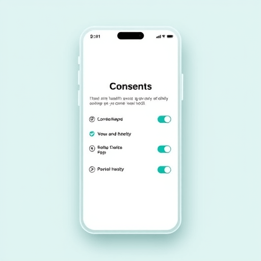
Granular consent UX is the practice of letting users make fine-grained choices about their data, then designing those choices to feel clear, reversible, and personal. Instead of one binary “I agree” button, users might see:
- Per-purpose toggles (“Share heart rate data to improve your sleep score,” “Allow this data to be used in anonymized research”)
- Per-recipient controls (“Share with my cardiologist,” “Share with a partner wellness program”)
- Time-bound options (“Allow access for 30 days, then re-confirm”)
- Plain-language explanations for each item, written at a sixth-grade reading level
- A persistent dashboard where users can review and revoke any choice at any time
The “UX” part matters as much as the legal structure. A granular consent model delivered through dense, jargon-heavy toggle walls is technically compliant but functionally useless. The best implementations treat consent as a conversation, not a form.
The Regulatory Tailwind in 2026
Health data rules have moved faster than many organizations expected. Several developments are pushing consent UX from a nice-to-have toward a baseline expectation:
- Updated FTC enforcement around “dark patterns” in health apps, with multimillion-dollar settlements for misleading consent flows.
- State-level health data privacy laws in California, Connecticut, and Washington that go beyond HIPAA, covering data health apps collect outside clinical settings.
- The 21st Century Cures Act’s information blocking provisions, which give patients more visibility into who has accessed their records.
- Emerging guidance from HHS on AI in healthcare, requiring clearer disclosure when algorithms use patient data for training or inference.
Together, these rules create a regulatory environment where vague, blanket consent is a liability. Granular consent is the safer default, and increasingly the legally required one.
Where Granular Consent Becomes a Competitive Edge
For digital health companies, the strategic question is not “how do we comply” but “how do we make consent feel like a feature.” Three areas stand out.
1. Patient Activation and Retention
When users understand what they are opting into and feel in control, they engage more deeply. Telehealth platforms that surfaced per-condition sharing options saw session completion rates climb by double digits in internal studies, because patients stopped treating the app as a black box. Granular consent turns a legal gate into a moment of clarity that builds habit.
2. Differentiation in a Crowded Market
The digital health market is saturated with apps that all claim to be “secure” and “private.” That language has lost meaning. A visible, well-designed consent dashboard is something users can actually see and point to. It becomes part of the brand story: this product respects you enough to show its work.
3. Higher Quality Data for AI and Analytics
Counterintuitively, asking for narrower consent often yields better data, not worse. Users who actively choose to share specific data points are more engaged and more accurate in their self-reporting. For teams training clinical models, that signal-rich, opt-in data is far more valuable than the noisy, blanket-consented firehose that comes from a single “agree to all” button.
Common Pitfalls in Designing Consent Flows
Granular consent is easy to get wrong. The most common failure modes in 2026 still look familiar from a decade ago:
- Consent fatigue: Too many toggles presented at once with no context. Users tune out and click through.
- Bundled defaults: “All on” as the starting state with an opt-out buried two layers deep. Regulators increasingly treat this as a dark pattern.
- Stale consent: Asking once at signup and never revisiting, even as data uses evolve.
- Unclear revocation: Making it easy to grant access but hard to take it back. Users notice, and they remember.
The teams that get this right treat consent as an ongoing relationship, not a one-time transaction. They re-prompt when a new data use is introduced, celebrate when users adjust their settings, and surface consent history inside the main product surface, not just a buried settings page.
What Good Granular Consent UX Looks Like in Practice
Across the strongest digital health products in 2026, a few patterns have become standard.
- Consent is introduced in the moment, not at signup. When a feature first needs a new permission, the prompt explains what is being requested and why, with a single tap to grant or decline.
- Every consent screen is paired with a short, human explanation written by a clinician or product writer, not a legal team.
- Users can see a timeline of who accessed their data and when, similar to a banking transaction history.
- Revocation is symmetric with granting: one tap to turn off, no support ticket required.
- Defaults are conservative. New permissions default to off until the user actively enables them.
None of this requires exotic technology. It requires product leaders who treat consent as part of the core experience rather than a hurdle cleared during legal review.
Where the Industry Goes From Here
Expect granular consent UX to evolve in three directions over the next year. First, consent will become portable, with users able to export their preferences across apps the way they export contacts today. Second, consent will become more contextual, surfacing different options depending on whether a user is in a clinical, wellness, or research context. Third, AI-driven consent assistants will help users understand long disclosure documents by summarizing what they actually mean in everyday language.
Digital health companies that treat this as a design problem, not just a legal one, will find themselves with a rare asset: a privacy posture that users can see, understand, and trust. In a market where most products still hide behind legalese, that visibility is not a minor enhancement. It is a moat.
The shift beyond HIPAA is not about abandoning compliance. It is about recognizing that compliance alone no longer earns patient confidence. The next generation of digital health leaders will be the ones who design consent the way they design every other part of the product: deliberately, empathetically, and with the expectation that users are paying attention.