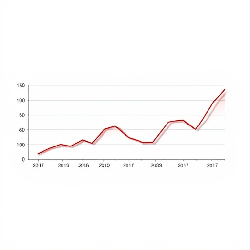
When I say our cohort churn chart predicted shutdown, I don’t mean it produced a dramatic dip in overall revenue or a sudden spike in cancellations. I mean it showed, in plain numbers, that every group of users we acquired after January 2025 was gone within eight weeks. That chart told us we would run out of cash in Q1 2026. We hit that date almost to the week. The saddest part isn’t that we missed the signal—it’s that we spent hours staring at it and still convinced ourselves we were special.
What Our Cohort Churn Chart Actually Showed
If you’ve never built a cohort table, it looks boring at first. Each row is a group of users who signed up in the same month. Each column shows what percentage of that group is still active after week 1, week 2, week 4, and so on. The best cohorts hold a line, then slowly bend. Healthy B2B SaaS products have a curve that starts around 80% and eventually flattens above 50%. Consumer apps can be messier, but you still expect to see a plateau form after the first month.
Our chart looked like a set of stairs going down. The January cohort started well—74% active in week 1. By week 4, it was 31%. By week 8, it was 9%. The February cohort was worse: 68% week 1, 24% week 4, 5% week 8. March was worse than February. April was worse than March. Every new cohort was smaller, stickier, and cheaper than the last. The curve never found a floor. It just kept falling, and because each cohort started lower, the whole chart tilted downward like a jaw slowly closing.
The “Smile” Never Arrived
Founders who care about retention look for the “smile” in a cohort chart. That’s the pattern where a cohort initially churns, then the remaining users find value, and the curve flattens or even bends upward after week 3. We never saw a smile. We saw a straight diagonal line escaping to the bottom right. A cohort churn chart with no stabilization is not a dip—it’s a death sentence printed in a spreadsheet.
Why Average Churn Made Us Overconfident
We made the classic mistake of averaging instead of slicing. Our overall monthly churn rate hovered around 12% for months. That sounds survivable if you’re adding enough new users. But cohort analysis strips away the noise of new signups. When you remove new user growth, the existing base was eroding much faster. The “12% average” was being propped up by a small spike of promotional users who churned the following month. The chart showed the truth, but we kept looking at the aggregate number because it made us feel less doomed.
Why We Rationalized Away a Perfect Prediction
You might think an obvious warning like that would trigger an all-hands pivot. Instead, it produced a series of increasingly desperate excuses:
- “Maybe the reporting window is wrong.” We wasted two weeks debugging the churn calculation. The chart was right all along.
- “These are early-stage users; they’re not our real ICP.” But we had no evidence the “real” ICP would act differently. We just wanted to believe a better customer would magically stick.
- “One product improvement will fix retention.” We shipped a new onboarding flow, a better dashboard, and a redesigned notification system. None moved the week-8 retention above 8% for new cohorts.
- “Churn is a lagging indicator; let’s focus on activation.” We didn’t realize that our cohort churn chart was already a leading indicator for shutdown. It wasn’t telling us what had gone wrong yesterday—it was telling us what would happen six months from now if nothing changed.
In hindsight, the problem wasn’t that we had a bad product. It was that we had built a “one-time value” feature, not a habit. Users signed up because a current task needed solving. Once the task was done, they never returned. A metric like Net Revenue Retention (NRR) would have hidden this because we rarely had expansion revenue. Cohort churn was the only metric that directly captured the absence of repeat value.
How to Read a Cohort Churn Chart Like a Failure Detector
You don’t need a data science team to see the future. You just need to set up three thresholds before you start analyzing:
1. Define the warning line for your business model
If you’re a subscription product, week-8 retention is often a strong predictor of month-12 retention. If week-8 active rate falls below 20%, you need a different product or a different audience. That’s not a rule of physics, but it’s a good rule of thumb. In our case, week-8 retention was below 10% for five consecutive cohorts. No company survives that without constant new paid acquisition—and constant acquisition is not a strategy, it’s a lottery ticket.
2. Compare cohorts to each other, not to industry benchmarks
The most dangerous phrase in startup analytics is “our churn is normal for our industry.” Industry benchmarks are useless when your cohorts are getting worse over time. A cohort churn chart that predicts shutdown doesn’t need to look catastrophic compared to other startups. It only needs to show that no recent cohort is behaving better than the last one. That pattern means your “improvements” aren’t improving the core experience.
3. Build a second chart for the first 7 days
The long-term cohort churn chart is easy to ignore because it feels distant. A first-week cohort chart is harder to dismiss. Looking back, our first-week retention was collapsing in a straight line. The January cohort had 57% of users return on day 2. By April, that number was 31%. We missed it because we were obsessed with monthly churn. If we had tracked day-1, day-3, and day-7 retention as separate cohorts, we would have seen the cliff before the churn curve flattened.
What I Would Tell Any Founder Facing This Pattern
If your cohort churn chart looks like ours, stop everything except retention work. Stop expanding the team. Stop running paid ads to pull more people into a leaky bucket. Stop arguing that your product will “click” for the next segment. There is no next segment that behaves so differently that it will ignore a weak core loop.
We should have paused all new feature development for one month and interviewed the five people from each cohort who stayed past week 4. We should have asked them one question: “what did you come back to do?” Instead, we kept adding features that made the product more complex but didn’t add a reason to reopen it. The cohort churn chart didn’t need to be “fixed.” It needed to be listened to.
In early 2025, we had six months of cash left and a chart that predicted we would need a miracle. We got neither. By the time we finally accepted the signal, it was too late to rebuild the product or reposition the audience. The shutdown was never a sudden event. It was a slow, predictable decay that had been plotted on a graph the entire time.
The Hardest Lesson
Startups love dashboards full of green arrows. We had a green arrow for “new signups” every week, and that made us feel alive. But the cohort churn chart was red from month one. We didn’t need a complex econometric model. We needed a founder who was willing to say, “This graph means we will die.” That founder should have been me.
If you build a cohort table and see a sustained downward slope, treat it as your board of directors warning you about a future shutdown. The chart isn’t math anxiety. It’s the closest thing your company has to a time machine. You can either change the product, change the audience, or change the calendar date you’ll have to announce the end. We chose the last option, and it was the most expensive decision we ever made.
In the end, our cohort churn chart predicted shutdown exactly as clearly as any financial projection could have. The graph wasn’t the failure. The failure was our unwillingness to believe what the graph was saying. If you see the same pattern in your own retention data, don’t wait for a crisis. Treat every downward cohort slope as a fire alarm. You won’t get six months of warning every time—but when you do, it’s the most valuable gift your metrics will ever give you.