
Creating and using a Personal Fatigue Map lets athletes convert continuous wearable data into a practical, individualized plan for when to push hard and when to recover; this article explains what a Personal Fatigue Map is, how to build one from HRV, sleep, and training-load data, and how to apply it to weekly training decisions.
What is a Personal Fatigue Map?
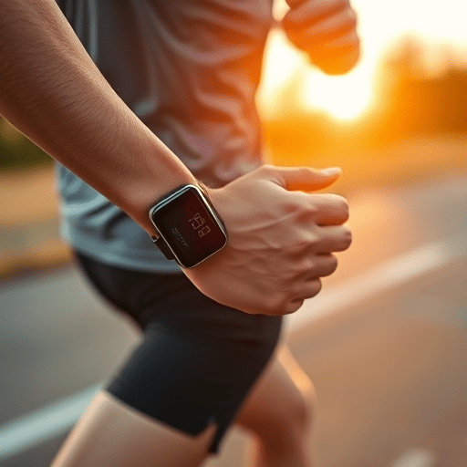
A Personal Fatigue Map is a visual or numerical representation of an athlete’s current recovery capacity and accumulated stress, derived from continuous wearable metrics (heart rate variability, resting heart rate, sleep, power/pace trends, and subjective wellness). Rather than relying on one-off tests, the map tracks trends and variability so athletes can spot windows of readiness for high-intensity sessions and identify when recovery interventions are needed.
Which wearable metrics feed the map?
- Heart Rate Variability (HRV): A sensitive marker of autonomic balance and recovery; falling HRV often signals increased fatigue or stress.
- Resting Heart Rate (RHR): Rising RHR over baseline can indicate accumulated fatigue or illness risk.
- Sleep Quantity & Quality: Total sleep, sleep stages, and sleep consistency are strong predictors of next-day performance.
- Training Load & Intensity: Session RPE, duration, and power/pace metrics create an external load timeline to compare against internal responses.
- Daily Activity & HR Response: Non-training strain (work stress, travel) and heart-rate responses during easy sessions add context.
- Subjective Wellness: Mood, soreness, and perceived recovery complete the picture — often the first signal to change plans.
How to build your Personal Fatigue Map (simple step-by-step)
- Collect continuous data for 4–8 weeks: daily HRV (morning), overnight sleep, resting HR, and training sessions logged with intensity and duration.
- Create baselines and variability bands: calculate a 7–14 day rolling mean and standard deviation for HRV and RHR; use z-scores or percentage deviation to normalize metrics.
- Combine metrics into a single fatigue index: weight internal load (HRV/RHR/sleep) slightly higher than external load, or use a simple scoring system (e.g., 0–100) where higher = more fatigued.
- Visualize trends: plot the fatigue index over time and overlay training sessions (easy/moderate/hard). Color-code zones: green (ready), amber (caution), red (high risk).
- Refine with outcomes: note days where performance surprised you or you felt ill, then adjust metric weights to better predict those events.
Using the map to time hard sessions
Decision rules derived from your Personal Fatigue Map turn data into training actions. Examples of practical rules:
- Green zone (ready): Proceed with scheduled interval sessions, threshold work, or race-pace efforts.
- Amber zone (moderate fatigue): Convert hard session to technique, aerobic endurance, or reduced-volume intervals (50–70% of planned intensity).
- Red zone (high fatigue): Prioritize recovery: easy aerobic, mobility, sleep, hydration, or a full rest day. Avoid maximal efforts.
For athletes using periodized plans, treat the map as a daily-layered overlay: the macrocycle still drives goals, while the fatigue map adjusts microcycles and the timing of peak intensity weeks.
Example weekly application
Suppose an athlete plans two hard sessions (Tue/Thu) and a long aerobic on Saturday. If Monday’s map shows low fatigue (green), keep Tuesday intervals. If Tuesday’s recovery data shows persistent HRV suppression and poor sleep, move Thursday’s hard session to Friday (when the map indicates recovery) and replace Thursday with an easy aerobic session. This flexibility preserves training quality while reducing injury and illness risk.
Speeding recovery with targeted interventions
The map not only tells when to avoid hard work but suggests what to do during recovery windows:
- Sleep prioritization: Add a strict pre-sleep routine and aim for sleep consistency for 2–3 nights after heavy load.
- Active recovery: Low-intensity aerobic sessions (40–60% VO2max) increase circulation and clear metabolites without adding strain.
- Nutrition & hydration: Increase carbohydrate and protein around sessions and improve overall calorie balance on high-load weeks.
- Autonomic resetting: Short mindfulness, breathing, or HRV-coherence sessions can hasten HRV recovery.
- Modalities: Contrast baths, massage, or compression can be used selectively when the map consistently shows slow recovery.
Common pitfalls and how to avoid them
- Overfitting to one metric: Don’t let a single HRV dip cancel training; always consider trends and corroborating signals (sleep, RHR, soreness).
- Ignoring subjectivity: Wearable data is powerful but must be paired with how you feel — subjective input often anticipates objective decline.
- Chasing numbers: Avoid training by small daily swings; use bands and thresholds rather than exact setpoints to reduce stress and decision fatigue.
- Technical noise: Ensure consistent measurement conditions (same time each morning for HRV/RHR) to reduce false alarms.
Putting it into practice: tools and scaling
Begin with simple tools: your wearable’s HRV and sleep summaries plus a spreadsheet to compute rolling means and a fatigue score. As you progress, consider platforms that integrate data streams and apply machine learning to refine your Personal Fatigue Map. Coaches can scale the approach to teams by anonymizing baselines and setting team-wide thresholds while preserving individual adjustments.
Adopting a Personal Fatigue Map aligns hard training with biological readiness, raises the quality of key sessions, and reduces the cumulative risk of overtraining or illness. Over weeks it improves training consistency and long-term performance.
Conclusion: A Personal Fatigue Map turns continuous wearable signals into smarter daily decisions—time hard sessions when your body says “ready” and use recovery windows proactively when it doesn’t.
Ready to train smarter? Start tracking consistently for two weeks, build your baseline, and let your Personal Fatigue Map guide your next training cycle.